Heya! Making people curious is somewhat my favourite thing to do, by “designing” the little things to bring joy in the ordinary. Or, in other words — create concepts that engage, resonate and connect. Always on the lookout for creative challenges.
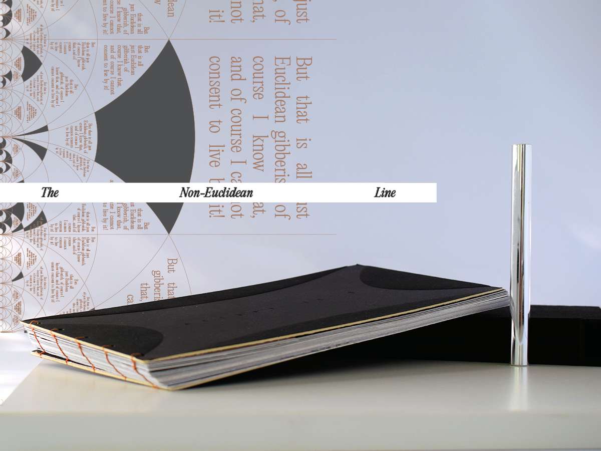
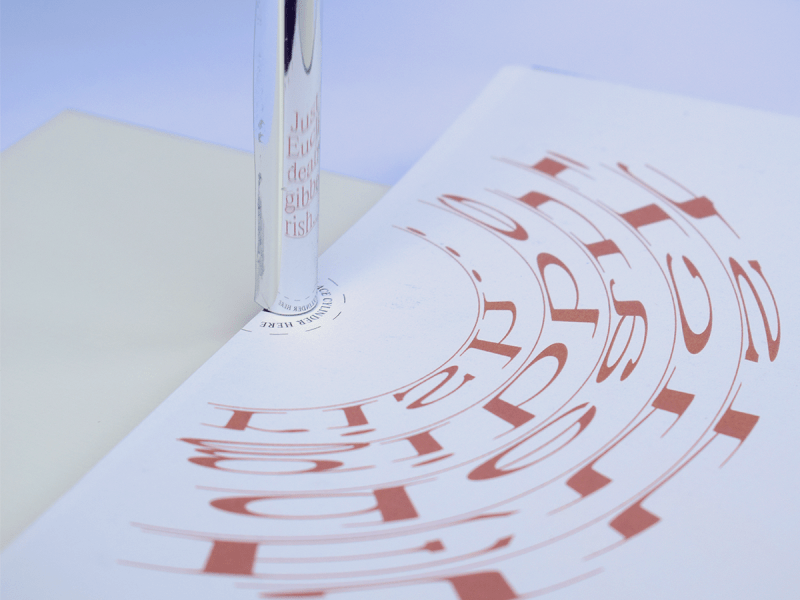
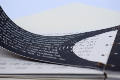
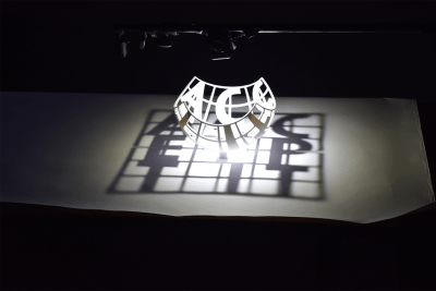
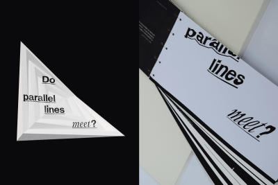
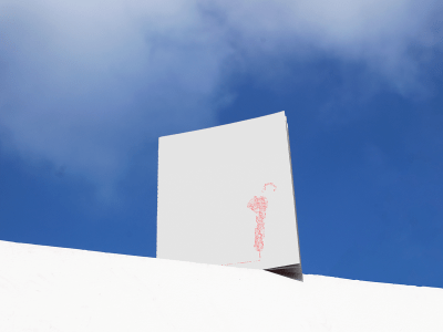
The human Duality through Non-Euclidean Type
ISTD 2024 Briefs| The Line
Conveying the perspective and mathematical quirkiness of the hyperbolic (parallel lines diverge) and elliptic (parallel lines cross) geometries. Through their non-Euclidean visuals and literary content from The Brothers Karamazov, an experience following the opposing lines of good/evil and true/false was created.
The exhibition experience consists of: animated typographic sequence (illustrating the three geometries), a hollow sphere that casts a flat-shadow message, and a book that delves deeper into the implications of the geometries on our perception.
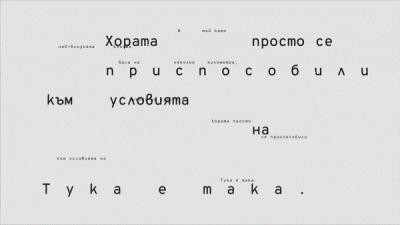
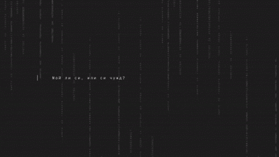
The “Wanderer’s” Dossier
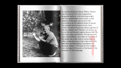
Conceptual Brief | Archives of Georgi Markov
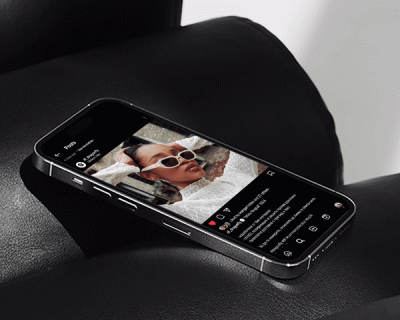
An animation for the online archives of political dissident, Georgi Markov. He is known as the umbrella-killed dissident on Waterloo Bridge, back in 1979. What often gets out of the radar are his theatrical plays and short fiction works, often overshadowed by his politically critical writings in the 70’s. The animated promo video is accompanied by a book, further detailing the goals of the project—raising awareness of his rich fiction oeuvre, not just the political one.
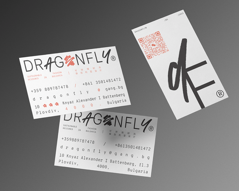
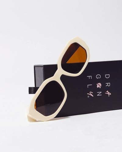
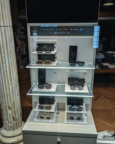
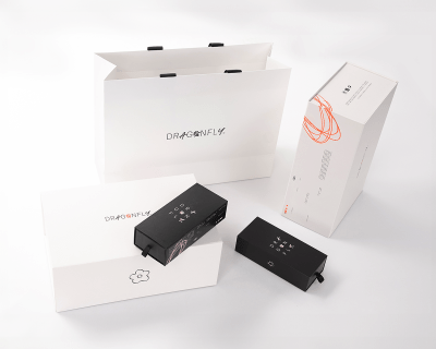
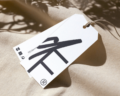
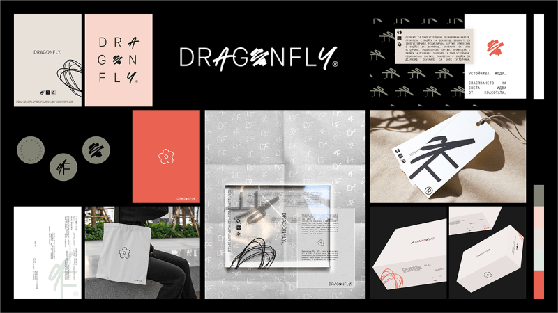
Dragonfly
Client Project | Sustainable Fashion
Sustainable clothing is yet to be as established in Eastern Europe, as it is in Western. Dragonfly’s goals are to promote fashionable fully recycled products to the wide audience. Using expressive typography, flexible brandmark system and playful scribbles, the brand stirs up the audience’s desire for adventure, the unknown and exciting.
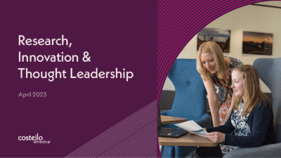
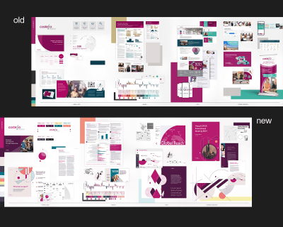
Costello Medical
Work Project | Brand Refresh
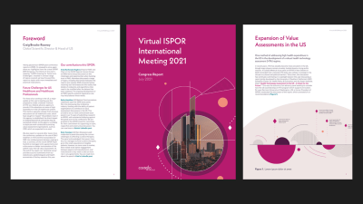
Costello Medical had been rapidly growing as a company and they were faced with a need of an identity refresh—effectively reflect their growth and brand image more accurately. The updated and streamlined identity shifts the focus towards care, thoughtfully crafted expertise and leadership.
My focus was on the concept, visual system, typography, colour palette and communication strategy. The integration continued after my time there, with the final product being a result of the creative input of the whole team. ↘
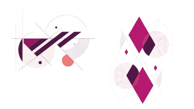
A more consistent system was developed by gathering the strong aspects of their visual language to refine its application. Line patterns, geometric shapes that resonate with the brandmark, change from the print-based old ITC Kabel to the newer Neue Kabel, updated, more accessible colour palette and a unified approach to photography.
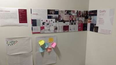
People could vote between 3 different concepts in all office locations and online.
To provide the best experiences, we use technologies like cookies to store and/or access device information. Consenting to these technologies will allow us to process data such as browsing behavior or unique IDs on this site. Not consenting or withdrawing consent, may adversely affect certain features and functions.
Functional
Always active
The technical storage or access is strictly necessary for the legitimate purpose of enabling the use of a specific service explicitly requested by the subscriber or user, or for the sole purpose of carrying out the transmission of a communication over an electronic communications network.
Preferences
The technical storage or access is necessary for the legitimate purpose of storing preferences that are not requested by the subscriber or user.
Statistics
The technical storage or access that is used exclusively for statistical purposes.The technical storage or access that is used exclusively for anonymous statistical purposes. Without a subpoena, voluntary compliance on the part of your Internet Service Provider, or additional records from a third party, information stored or retrieved for this purpose alone cannot usually be used to identify you.
Marketing
The technical storage or access is required to create user profiles to send advertising, or to track the user on a website or across several websites for similar marketing purposes.