Specialising in branding and packaging, experiential design and illustration, my concepts aim to engage the target audience of each project with imaginative designs tailored to their particular needs. I also have experience in fine art, specifically sculpture.
Product Design – Pearlfisher
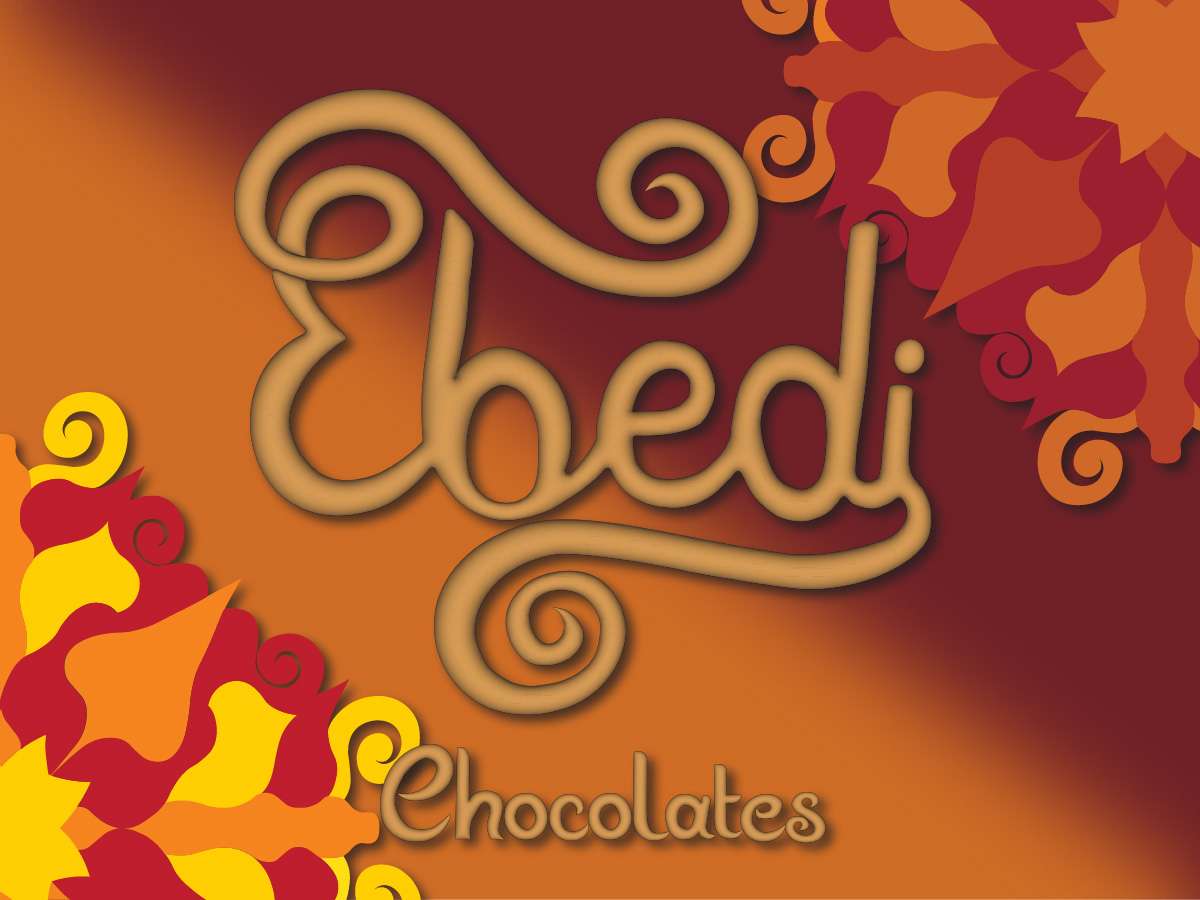
Ebedi Chocolates
Brand Story
Ebedi is a spiced chocolate brand that brings luxury and opulence to the high street.
The brief for this competition asked us to create a graphic identity based on a rare and unique phenomenon. This brand was inspired by an eternal flame located in Turkey. I was drawn to this particular phenomenon because of the culture surrounding it. There is a legend at this site of a fire-breathing beast called the Chimera, which was part lion, goat and snake. This beast, according to the Illiad, was destroyed at the sight and it is said that her flame can still be seen burning at the sight all these years later. This story fascinated me and influenced quite a few of my design decisions.
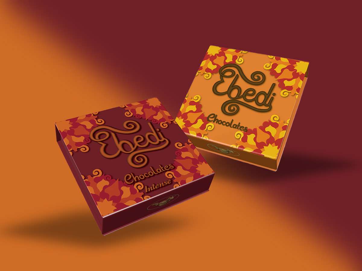
The aim of this project was to create luxury chocolates that really have a sense of occasion. I want to take the consumer on a sensory journey through the storytelling, captivating product design and enticing flavours.
Tone of Voice
The origin of the project, the eternal flame, has greatly influenced this. The tone will be one of passion and intrigue and comes through in the dazzling colour palette, bold design and the aromatic spices from the Turkish culture.
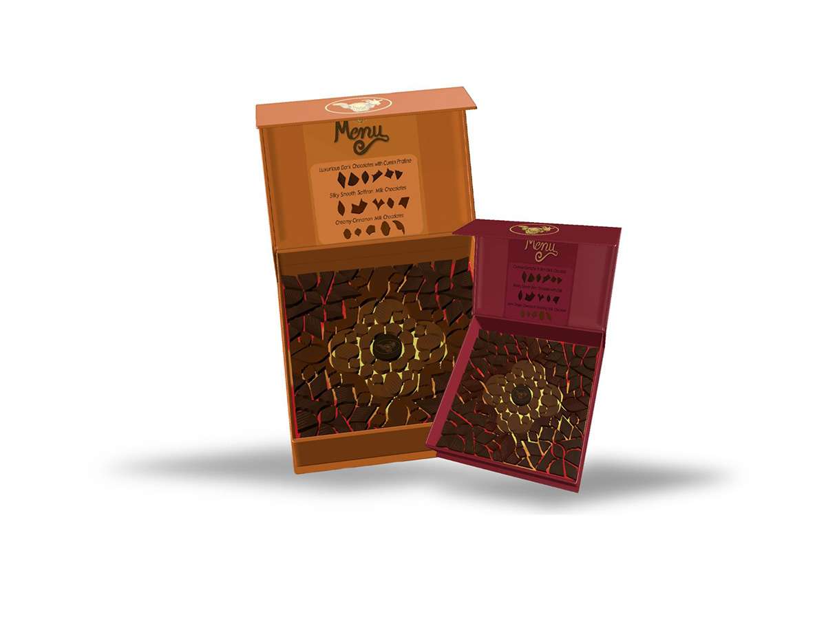
The Chocolates
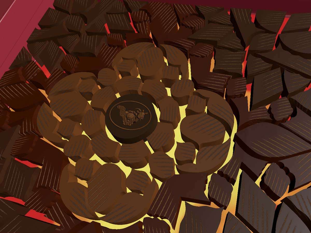
Not only did the Chimera legend influence the logo, but it also affected other design decisions. The scratches embossed on the chocolates are also a discreet reference to the great mythological creature’s ferocious nature.
The shapes of the chocolates have been inspired by the ornate Turkish lamps. I was fascinated by their beauty and elaborate detailing and I wanted to mimic that in my design and layout of these confectionaries.
Brand Application
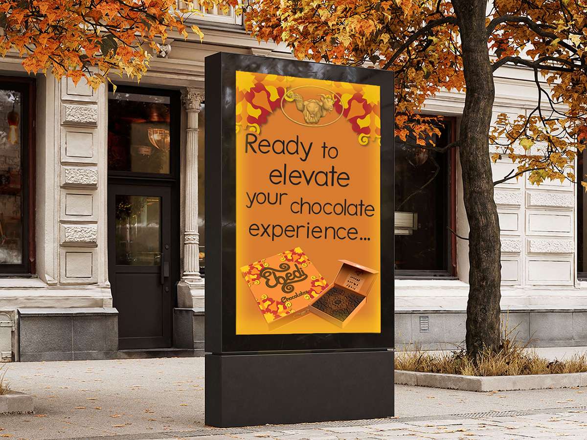
When the target audience is walking home from work they may decide they need a treat after a hard day. This touchpoint also indicates that the brand is different from its competitors through its language and use of ellipsis.
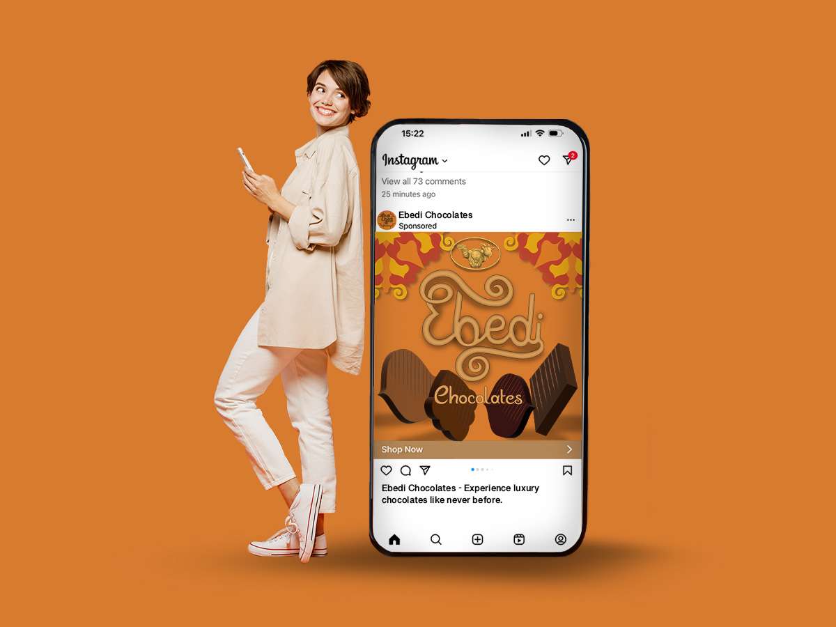
The brand will gain exposure through sponsored posts on social media.
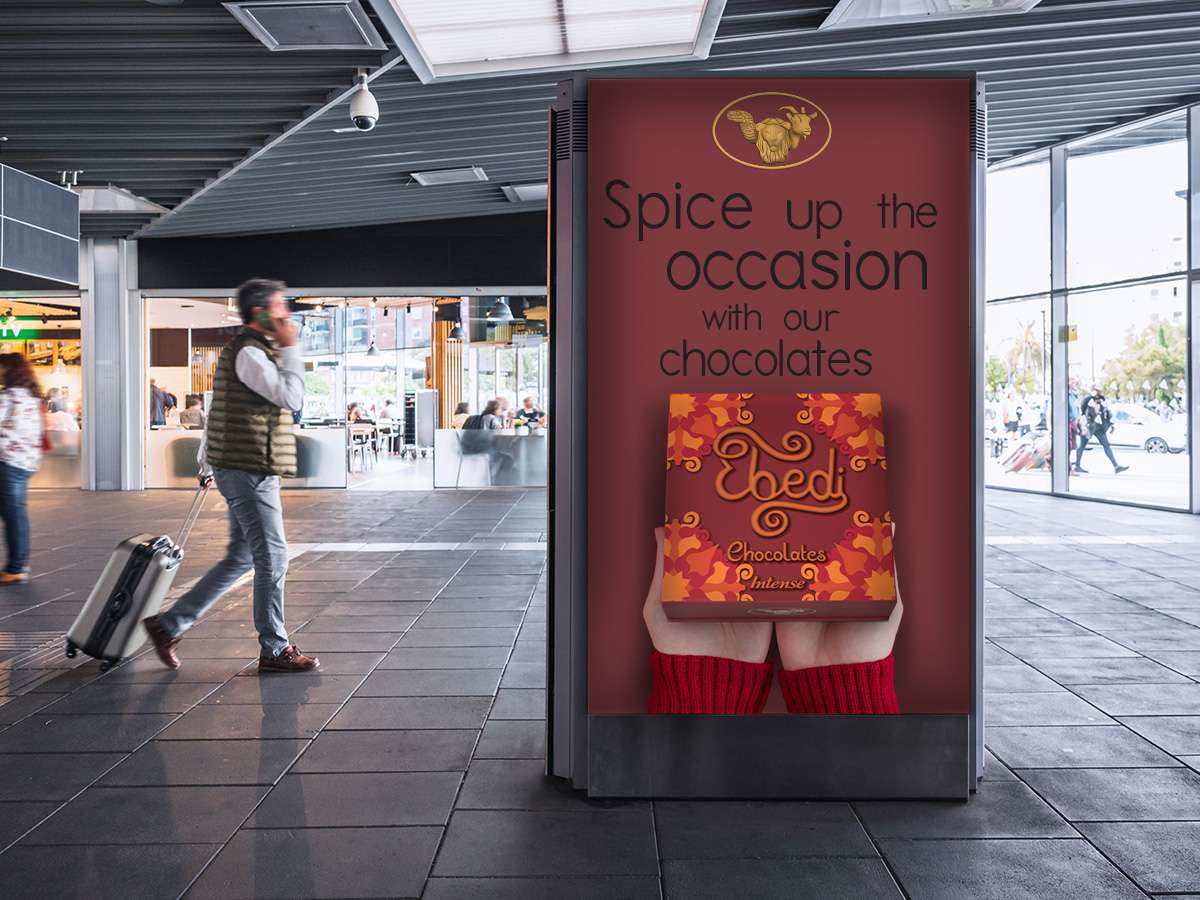
Having this product in an airport is a great selling touchpoint for people wanting to get a something special or a present for someone. The touchpoint also helps the brand expand internationally.
Experiential Design – D&AD
Coca-Cola
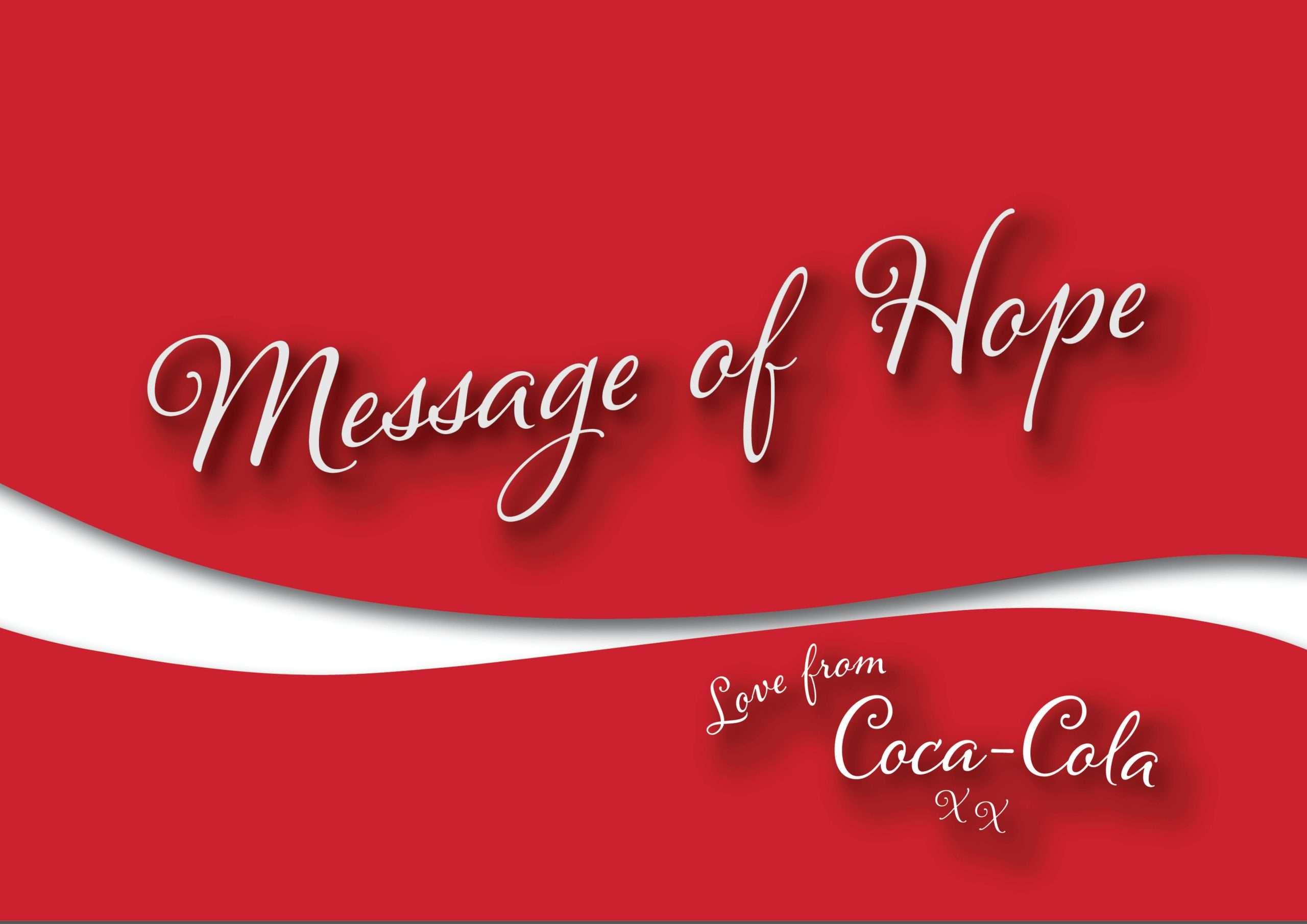
Message of Hope
Currently in the world today, Gen Z are emerging as one of the most stressed demographics in the workplace. They face multiple issues such as financial instability and job loss, which is causing some serious problems for their mental health. Message of Hope is a social campaign that focuses on connecting people back to themselves. To give them small messages of hope and reassurance. Another goal of this project is to start Gen Z talking about serious issues. People often internalise their problems. The aim of this project is to break down those barriers and start up what could be life saving conversations.
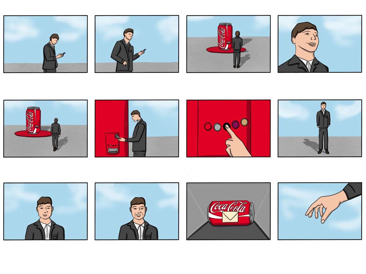
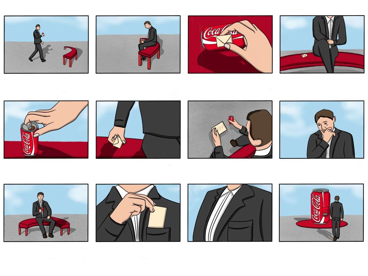
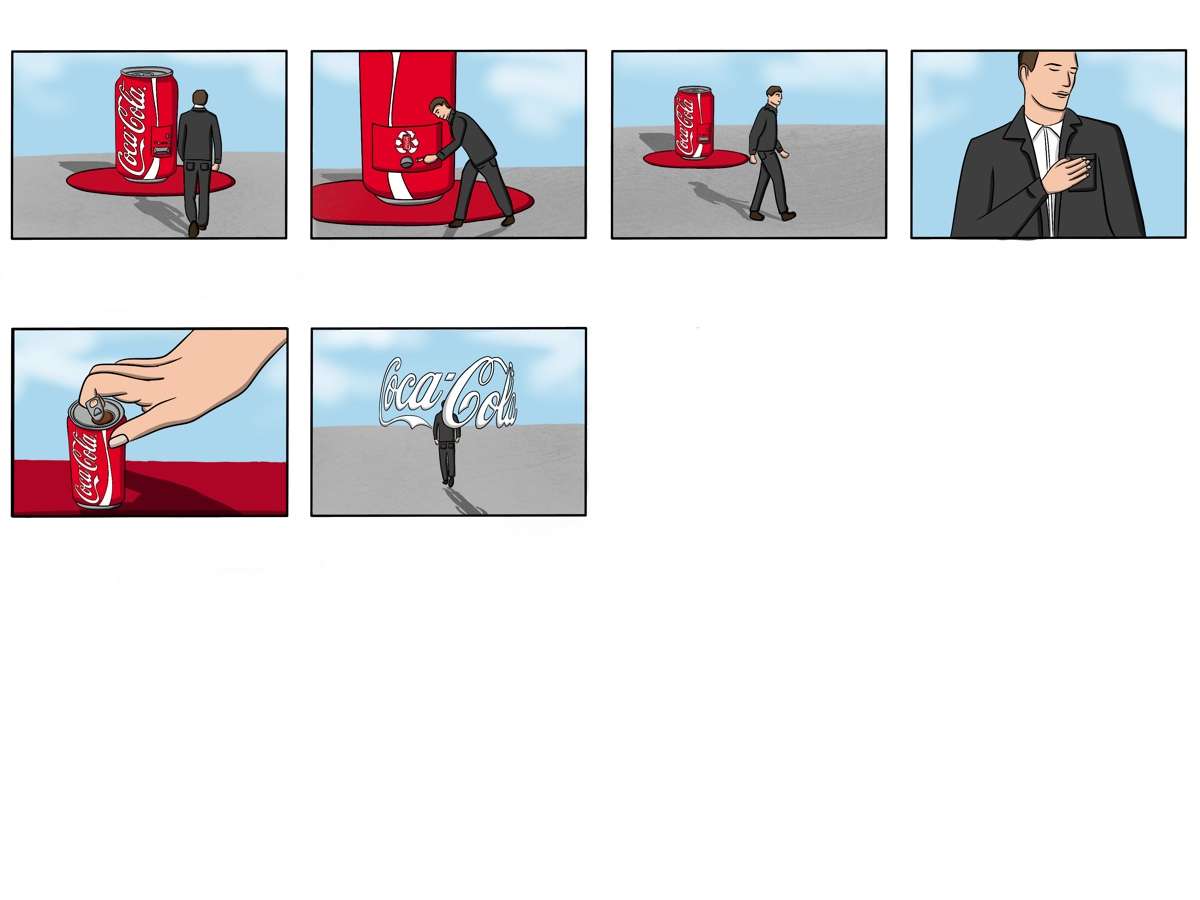
Storyboard
This is my ideation of how the campaigns advert would unfold. The storyboard reads from left to right on each row.
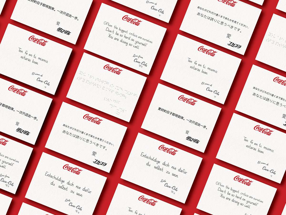
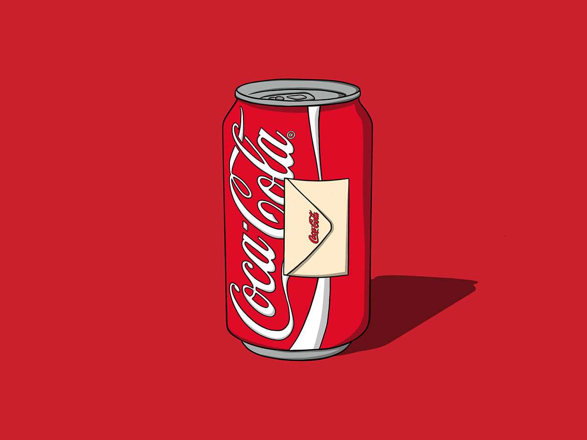
The Letters
The messages will be delivered in the form of small letters attached to the Coca-Cola cans. I have included hand written typography and ‘Love from’ signatures to achieve a personalised tone of voice to the letters. The personalised design approach will make the reader feel like Coca-Cola really care about their consumers.
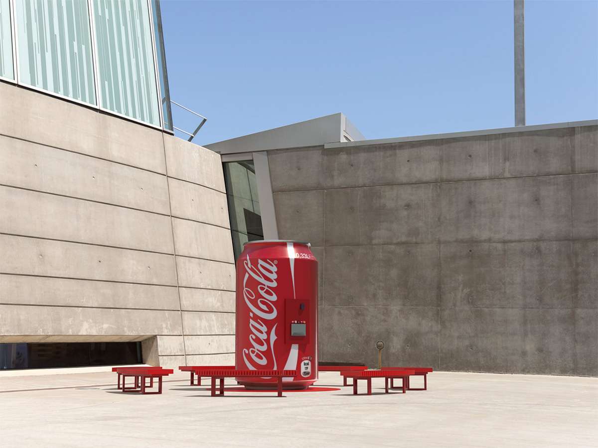
The Machine
The messages will be delivered on the Coca-Cola cans and these cans will be delivered to the target audience from the vending machine. The vending machine has been designed to be distinctive and eye-catching in the cities it will be situated in. The substantial size of the machine and excessive use of Coca-Cola’s iconic red will draw the Gen Z audience in to interact with it. The colour scheme also allows the campaign to stay on brand.
Page 1
Page 2
Page 3
Illustration – Roulette
Book
Background
This final project is a small book filled with advice, encouragement and support for early teens, specifically children aged 10-14 years old. Statistics show that this age group are one of the most at risk demographics when it comes to mental wellbeing. It is a book that will strengthen their mental well-being and give them guidance as they mature and start to navigate through life.
Illustrations
These illustrations will feature in the book alongside the messages as spot illustrations. Each character will have their own personality and behaviours. They will be very important in making the messages in the book more memorable for them.
Please visit my personal portfolio to see the finished book design.
To provide the best experiences, we use technologies like cookies to store and/or access device information. Consenting to these technologies will allow us to process data such as browsing behavior or unique IDs on this site. Not consenting or withdrawing consent, may adversely affect certain features and functions.
Functional
Always active
The technical storage or access is strictly necessary for the legitimate purpose of enabling the use of a specific service explicitly requested by the subscriber or user, or for the sole purpose of carrying out the transmission of a communication over an electronic communications network.
Preferences
The technical storage or access is necessary for the legitimate purpose of storing preferences that are not requested by the subscriber or user.
Statistics
The technical storage or access that is used exclusively for statistical purposes.The technical storage or access that is used exclusively for anonymous statistical purposes. Without a subpoena, voluntary compliance on the part of your Internet Service Provider, or additional records from a third party, information stored or retrieved for this purpose alone cannot usually be used to identify you.
Marketing
The technical storage or access is required to create user profiles to send advertising, or to track the user on a website or across several websites for similar marketing purposes.