Callum Close
A graphic design student with an interest in photography, film and conceptual design. Studied architecture for a year before switching to graphics and still maintain a keen interest in architecture and the built environment.
A graphic design student with an interest in photography, film and conceptual design. Studied architecture for a year before switching to graphics and still maintain a keen interest in architecture and the built environment.
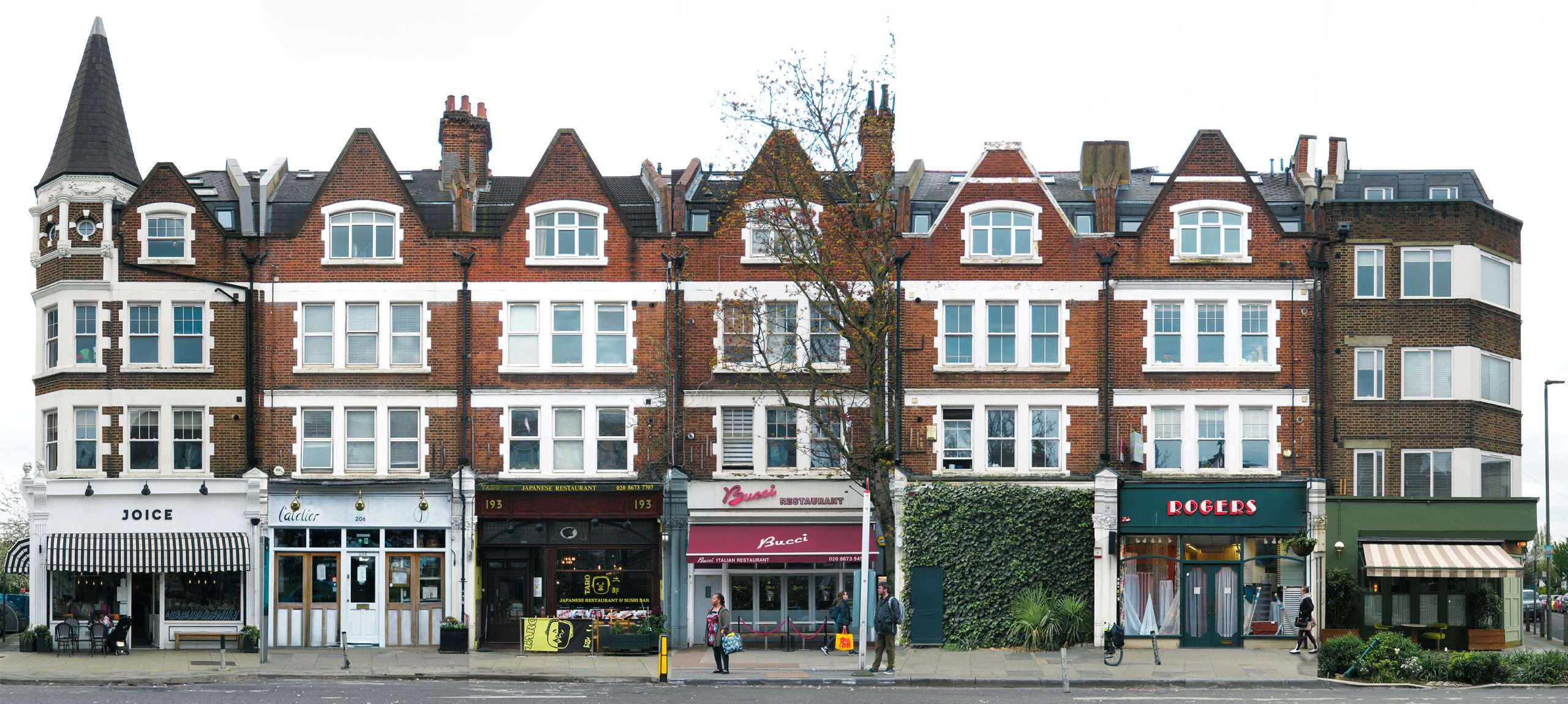
The “Clone Towns” project is a multi-faceted campaign focused on visualising and communicating the issues surrounding current shop design and High Street culture. The term ‘clone town’ refers to a place where the High Street or other major shopping areas are significantly dominated by chain stores. This issue worsens when these areas are populated by the same few chains, resulting in what are known as “copycat high streets.”
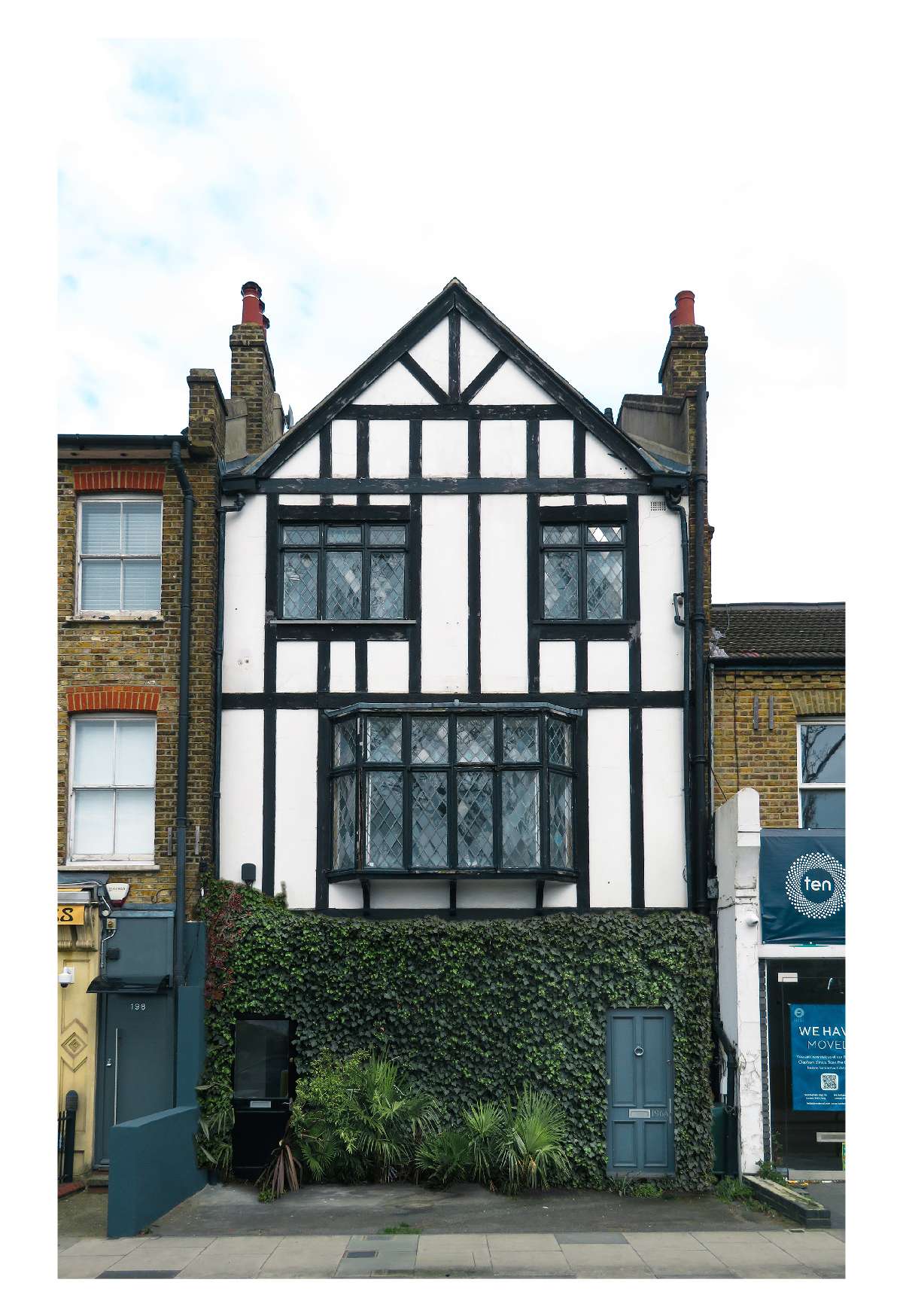
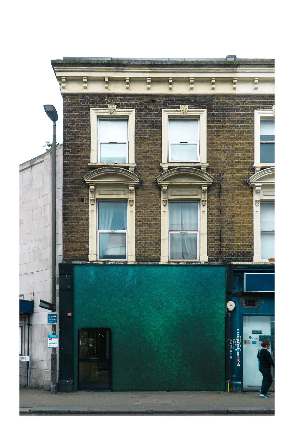
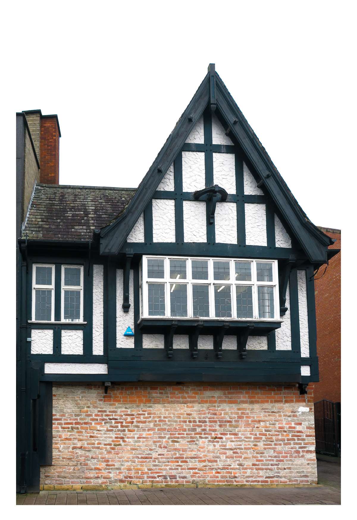
The project is primarily concerned with the design of shop fronts and their impact on a place’s cultural heritage and identity. Chain stores often prioritise brand consistency over local aesthetics, leading to a uniform and monotonous appearance that erases the unique character of individual places. This homogenisation affects not only the visual appeal but also the cultural identity of towns, making them indistinguishable from one another.
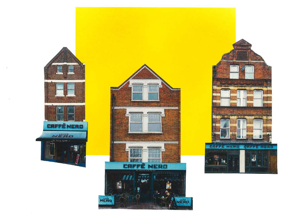
Chain stores frequently employ a minimalist, sans-serif, and plastic design approach. While this style is cost-effective, it is often uninspired and fails to respect the architectural and cultural context of local areas. The project criticises these “copy and paste” designs for their lack of creativity and consideration for the unique characteristics of the buildings and neighbourhoods they occupy. The pervasive aesthetic of chain stores has even influenced independent shops, many of which mimic this style to remain competitive, further spreading bland design and undermining efforts to maintain distinctive local identities.
While chain stores bring economic advantages such as job creation and brand reliability, the project argues that these benefits often come at the cost of local cultural degradation. The campaign emphasises that economic support from chains should not excuse their negative impact on local aesthetics and identity.
The goals of the “Clone Towns” project include highlighting the lack of thoughtful design in chain stores that strips areas of their unique character and cultural heritage. By showcasing examples of shops that maintain or incorporate unique and inviting designs, the project encourages a movement towards individualism and creativity in shopfront design. Highlighting successful independent shops and thoughtful chain store designs can inspire others to prioritise aesthetics and local identity in their business models. Ultimately, the campaign aims to foster better design practices that enhance the visual diversity and cultural richness of shopping environments, honouring the distinctiveness of each locality.
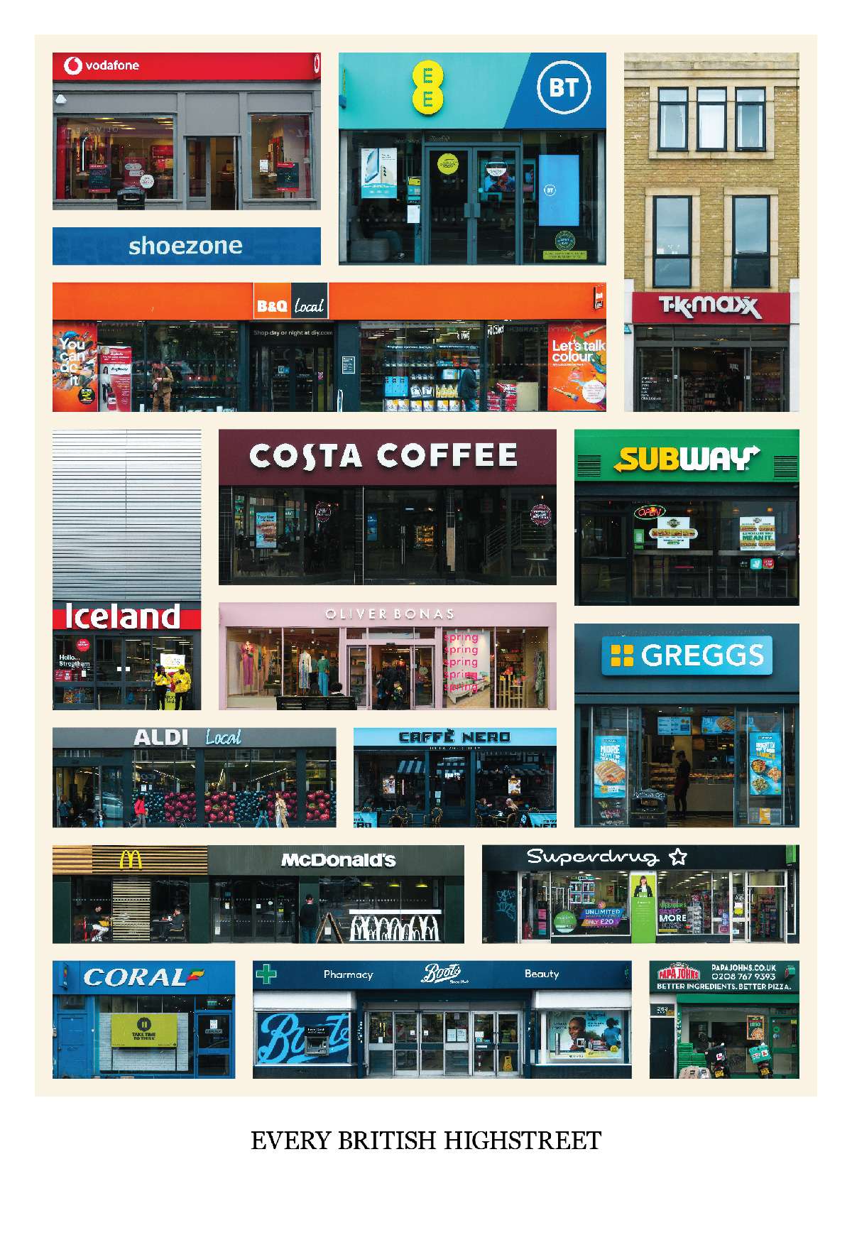
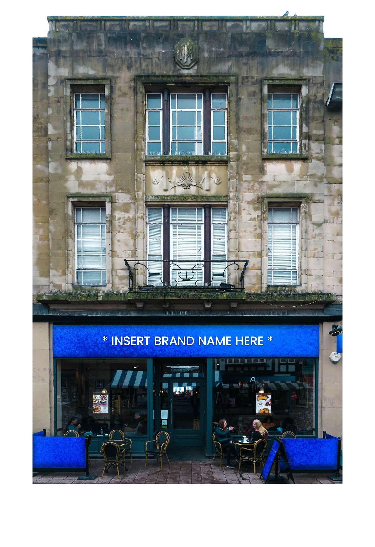
The “Every British Highstreet” poster aims to have a clear and blunt message. Walking down most high streets it is likely to find some, perhaps most of these chain stores. The poster almost takes the form of a bingo card which you could cross off as you explore the shopping district of a local area. The “Insert Brand Name Here” poster is another impactful graphic with a straightforward message. It prompts consumers to recognise the lazy and copycat style prevalent among most chain stores and urges corporate businesses to invest more thought into the design of their many branches. This poster serves as a reminder that they should strive to avoid being categorised by such uninspired design.

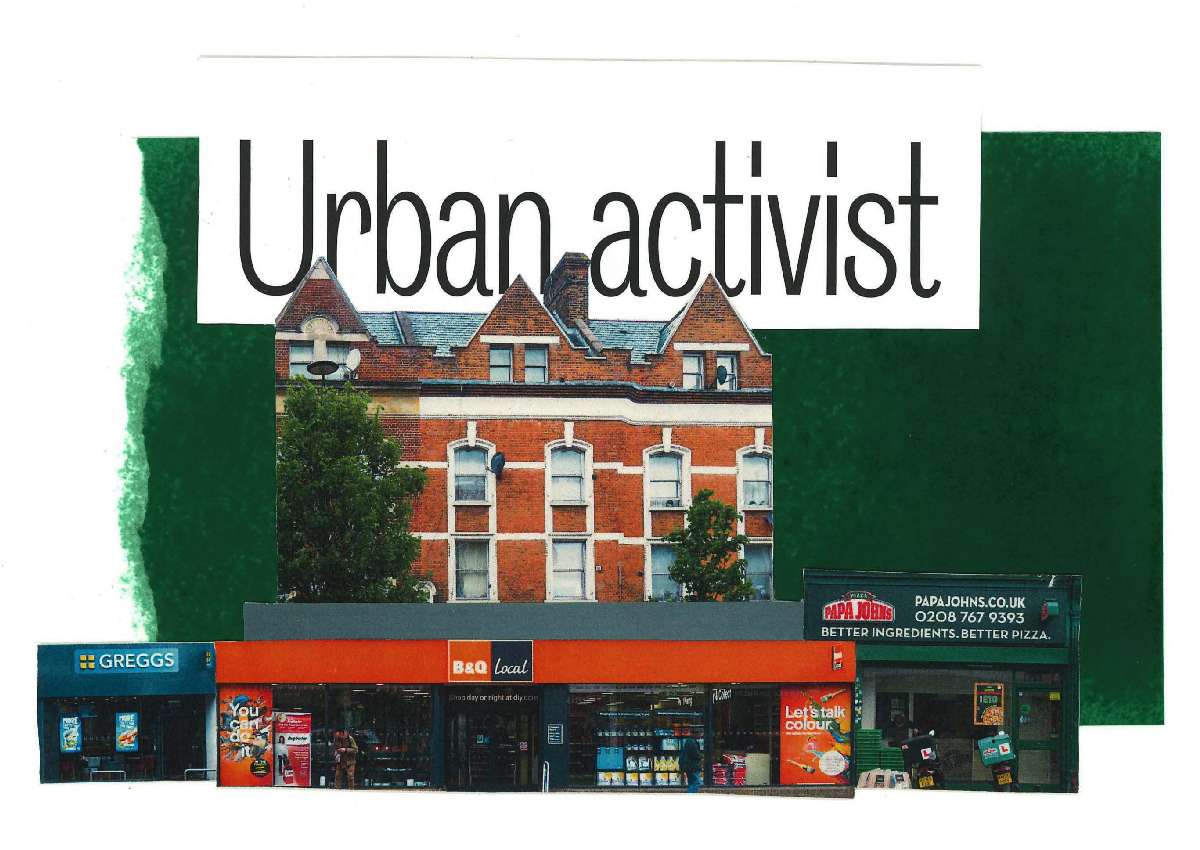
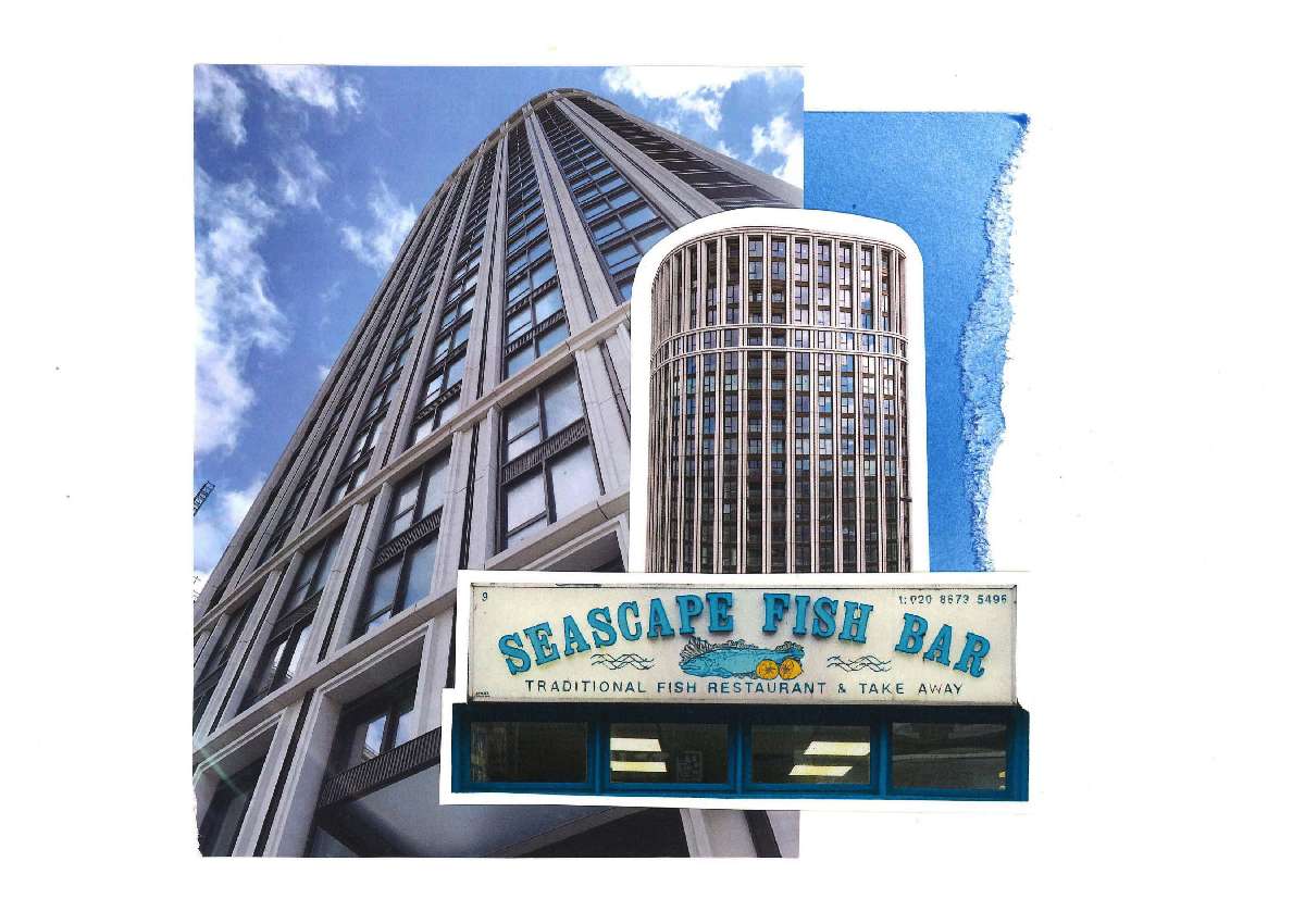
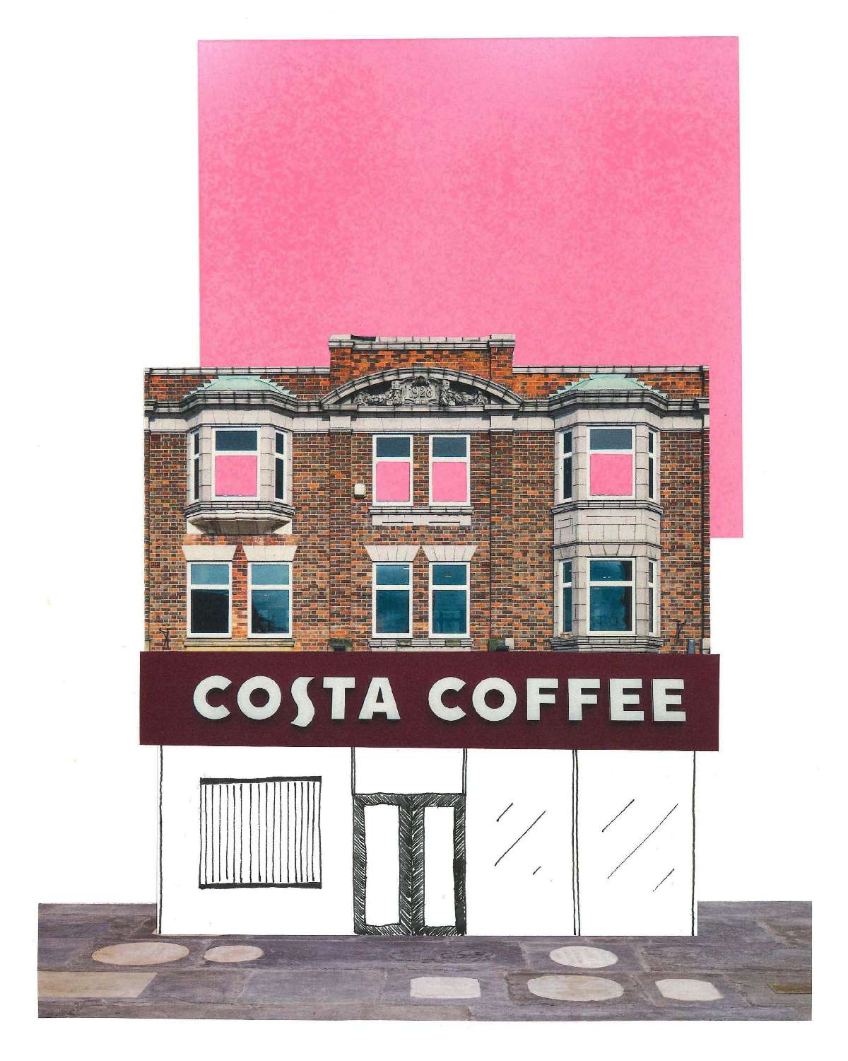
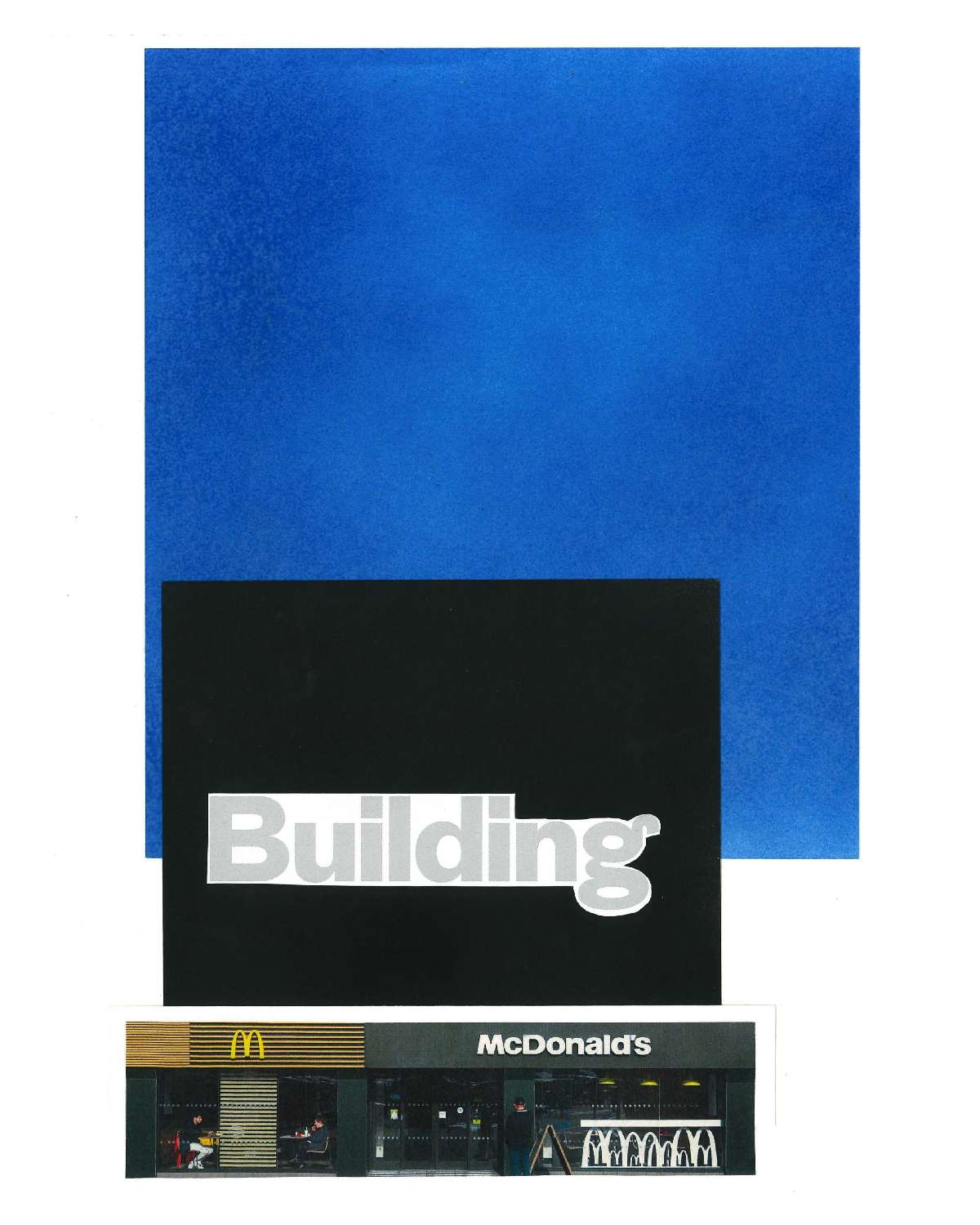
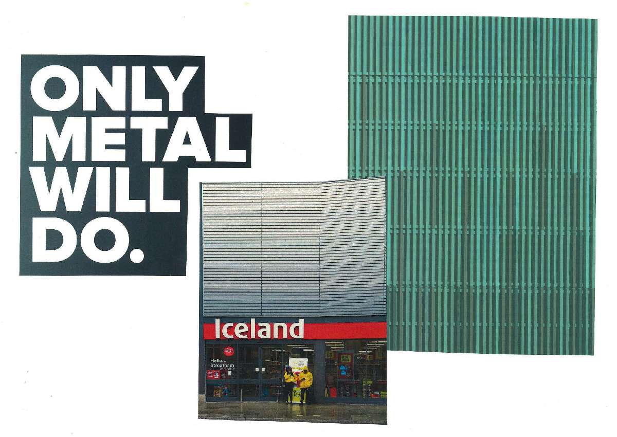
This series of collage posters aims to address the issue in a more abstract and eye-catching manner while still presenting thought-provoking design ideas, albeit with a more subtle approach, compared to the statement posters. Among the messages conveyed in these collages, the top left one highlights the positive impact of adding green spaces to urban areas. However, it suggests that local governing bodies must also consider the types of shops populating their high streets and the design of these chain stores to truly enhance the local streetscape. The middle right collage challenges the significance of the architecture and buildings that chain stores occupy, prompting viewers to reflect on the broader impact of these designs on the community.

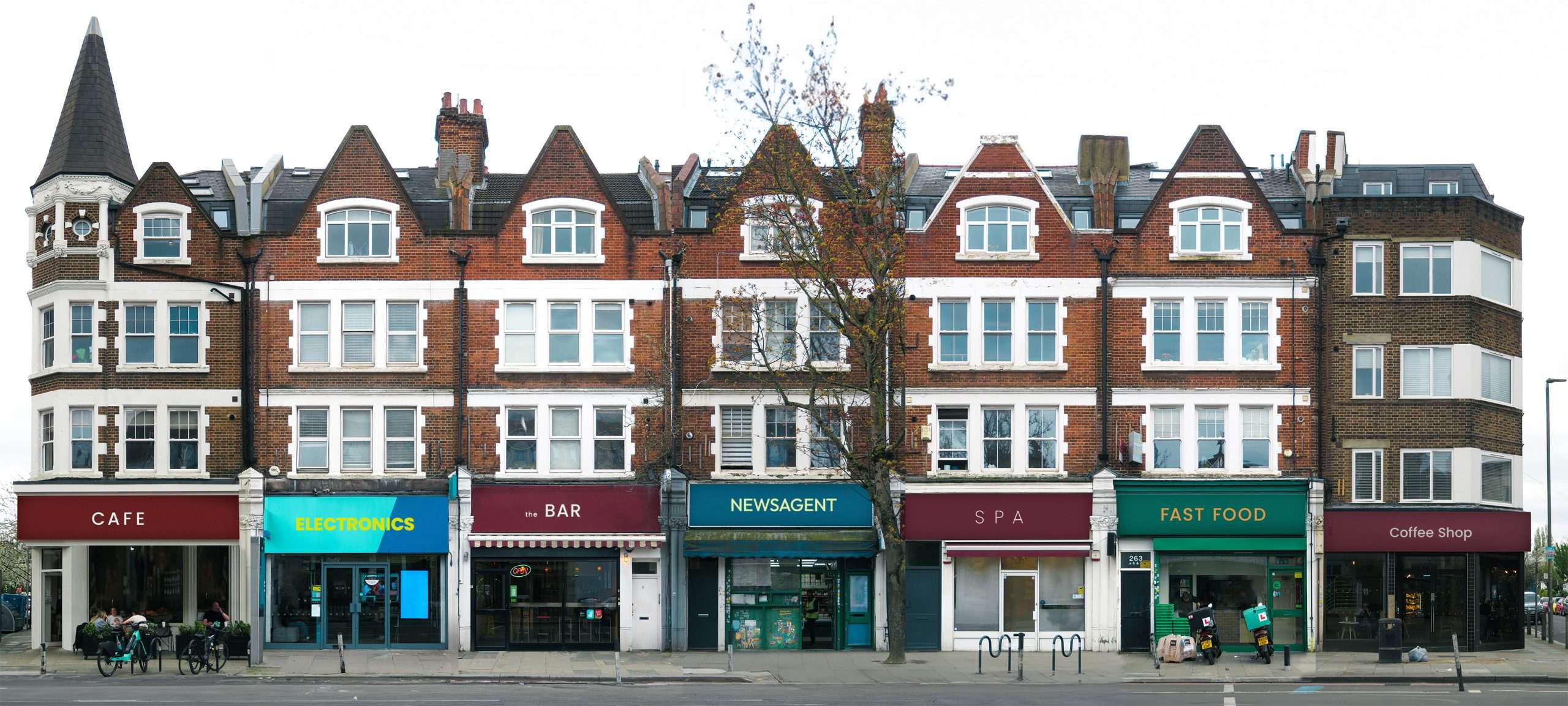
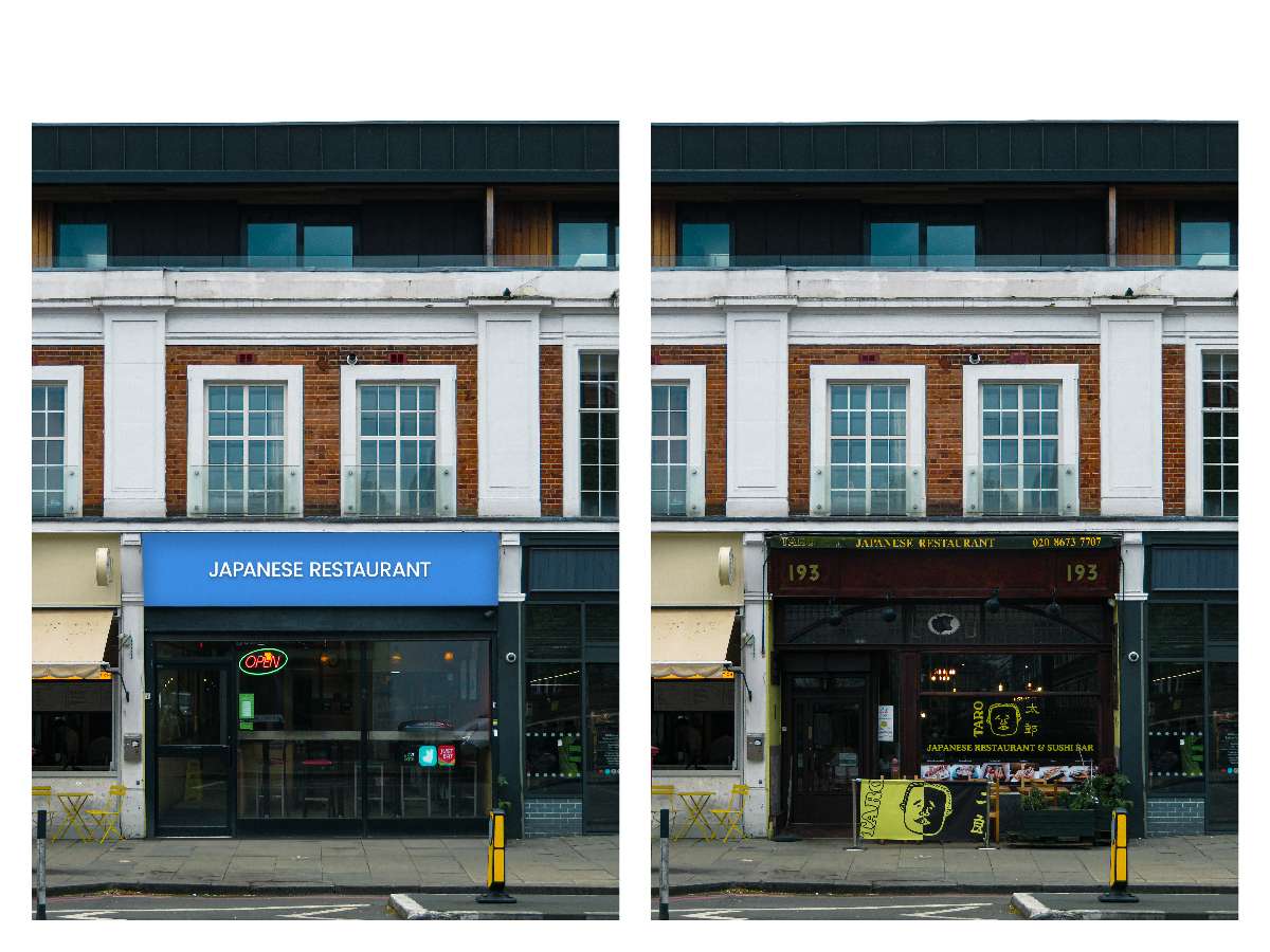
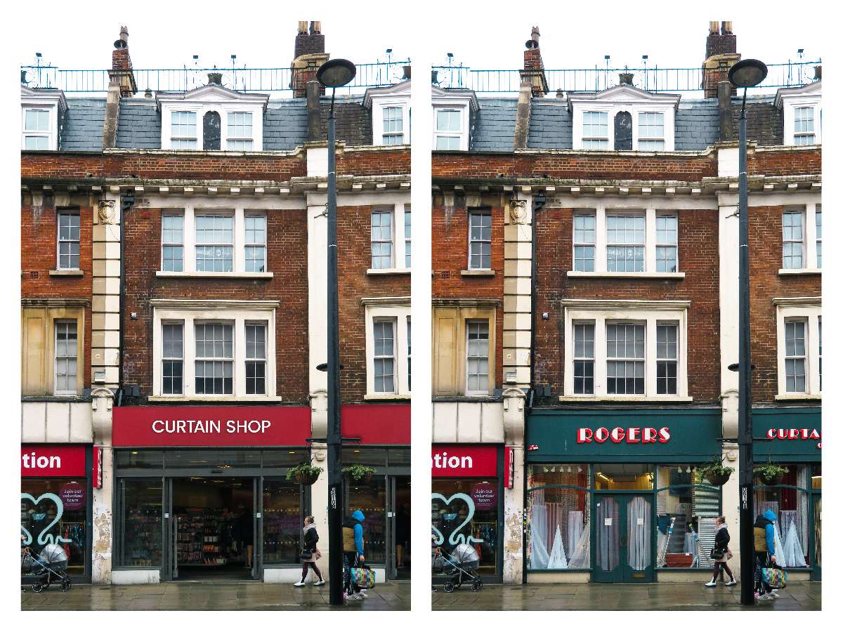
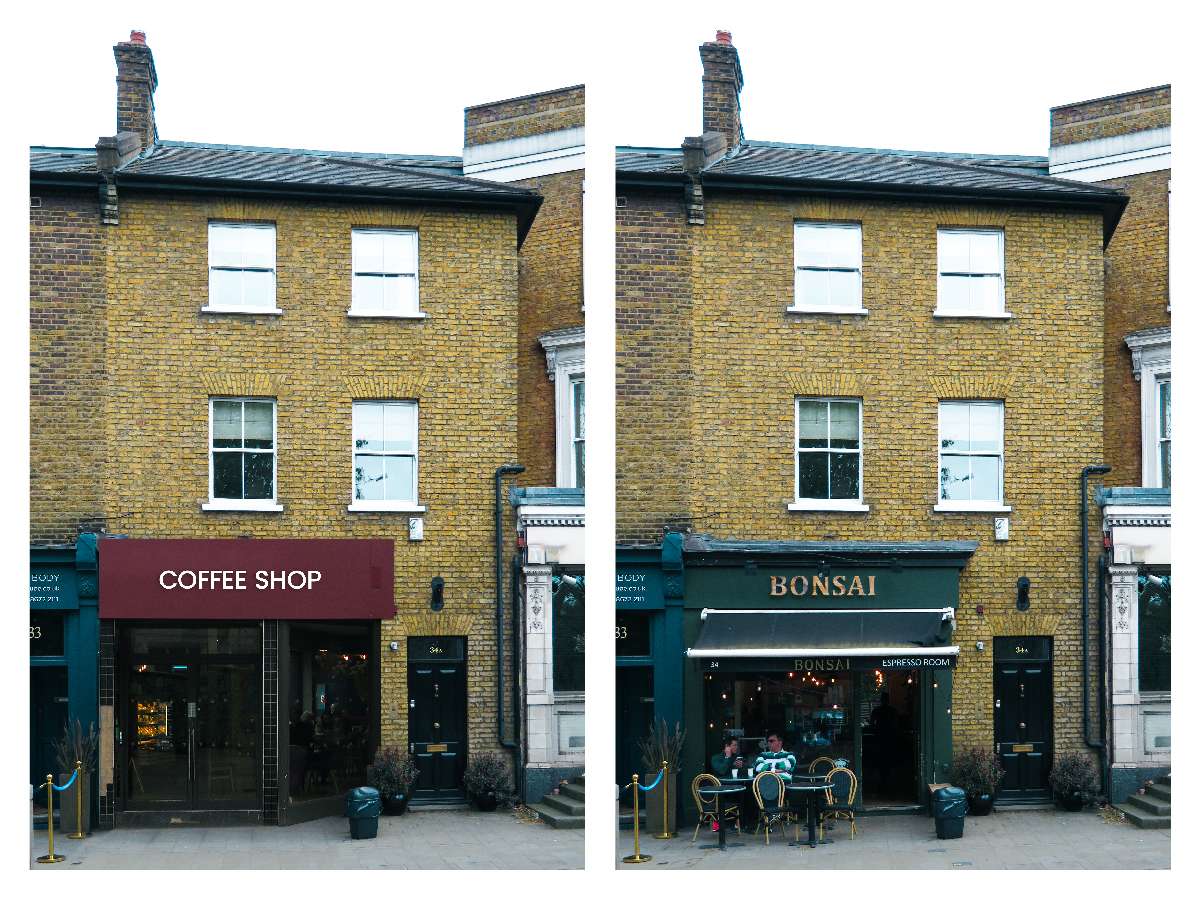
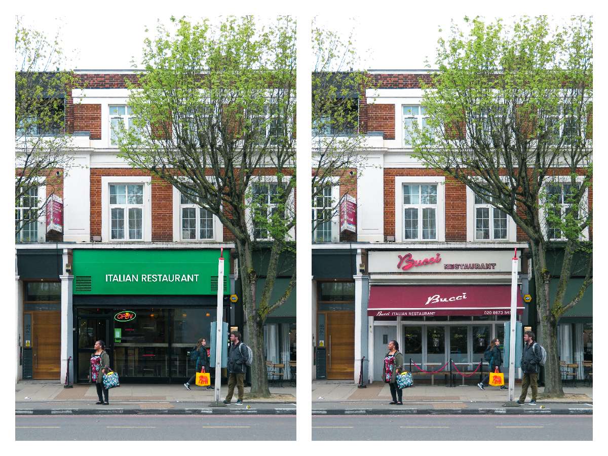
These ‘spot the difference’ posters highlight unique and interesting designs, posing the question of what could happen if corporate chain stores replaced them with uninspired, minimalist designs. By contrasting individual, creative storefronts with bland, copycat alternatives, the posters emphasise the importance of thoughtful shop design in maintaining the character and appeal of local areas.
This experimental series of posters presents viewers with nonsensical alternatives to traditional storefronts. These outlandish ideas aim to highlight the repetitive nature of copycat store designs by contrasting them with absurd replacements. By fighting the monotony of repetitive shop design with intentionally ridiculous concepts, the posters underscore the need for more creativity and individuality in commercial shop design.