I am a graphic designer with a passion for typography and editorial design. Creating bold, typographic designs with restricted but eye-catching colour palettes is something I love; finding ways to spread information in a way that engages an audience.
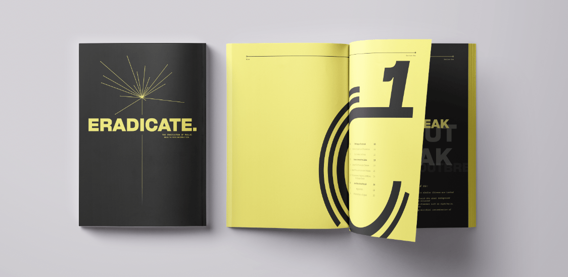
‘ERADICATE.’ Magazine
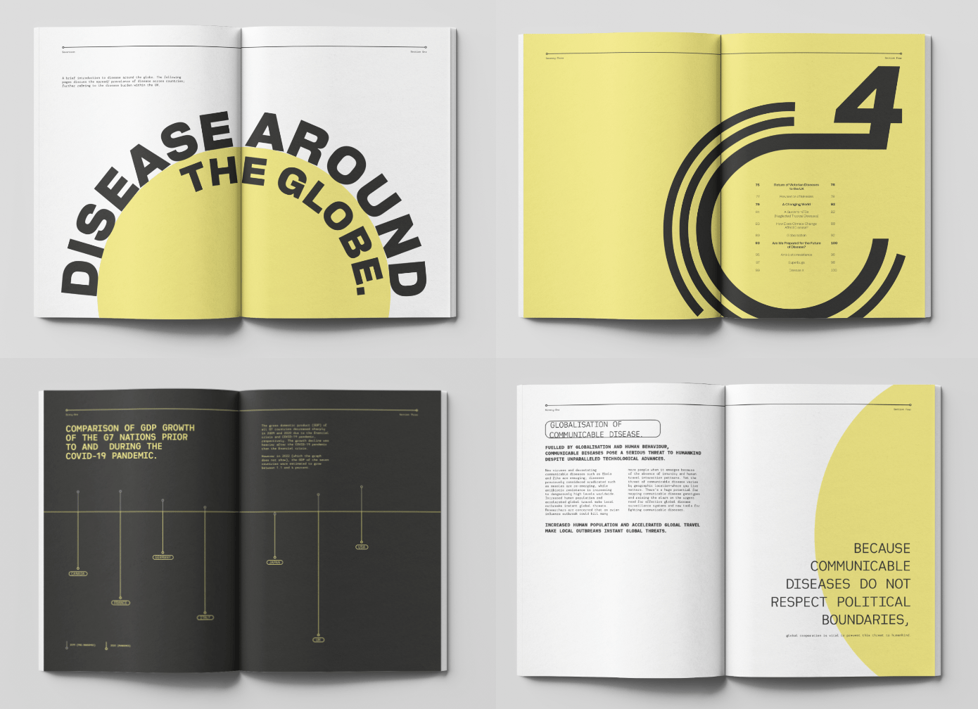
I created ‘ERADICATE.’ magazine as a response to the emergence of infodemics in the digital environment that we now live in.
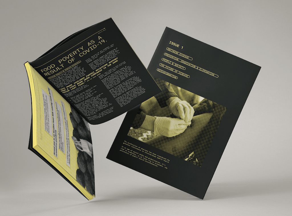
Vulnerable online groups include young people – and so I created a publication that finds a way to present objective public health information in a visually engaging style – that breaks down complicated research or ‘boring’ reports.
Within the first three months of 2020, researchers said at least 800 individuals died due to the spread of misinformation, also leading to nearly 6,000 hospitalisations.
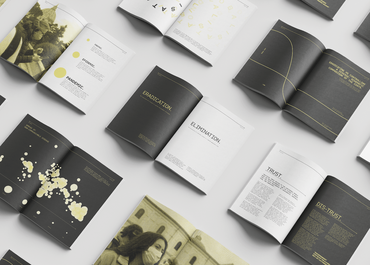
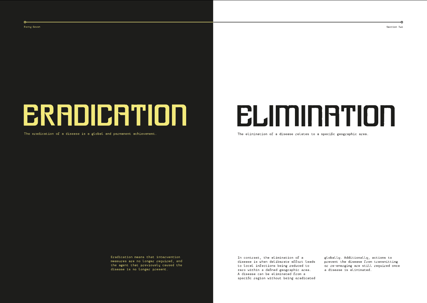
I defined my visual language on two key factors. The first was pathogens, particularly the Covid-19 pathogen, which led to the circular imagery. Furthering this, I took inspiration from spike proteins (the parts that extrude from the pathogen), slowly developing into my work, creating a rigid and linear structure.
Secondly, I researched existing media regarding health and medical advice such as NHS posters and the Covid-19 briefing lecterns. From this I decided on a colour palette of black and white for contrast. Yellow is globally recognised as a colour of warning, its contrast to the black creates an eye-catching and impactful design.
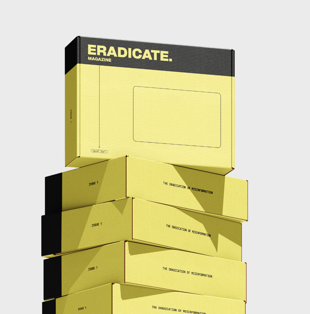
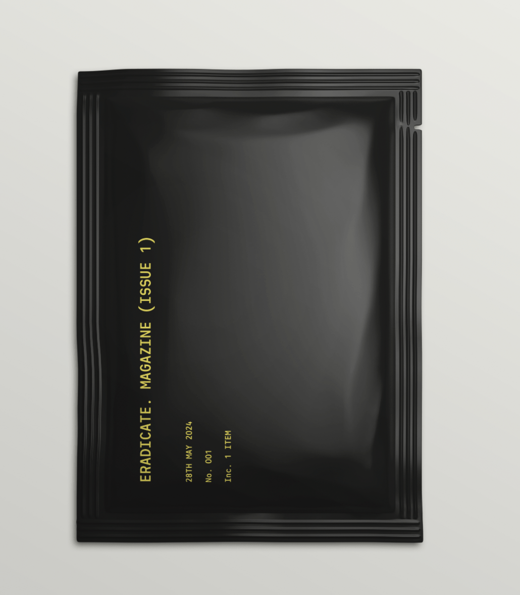
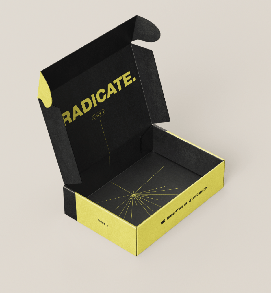
Delivery Packaging
Taking inspiration from a Covid-19 home testing kit, I developed a design where the magazine is delivered in a mailing box and wrapped in a sachet-type material – as found within the test boxes.
Magazine boxesMagazine wrapInside of box
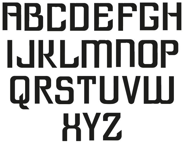
ERADICATE Bespoke Typeface Design
Following the creation of ‘ERADICATE.’ and my love for typography, I created a bespoke display typeface.
The typeface takes inspiration from the visual language of the magazine, such as rounded corners to communicate the circular imagery found throughout the magazine, but in synergy with with sharp edges that create a more impactful feel to the typeface. This generated a bold, eye-catching design that communicates coherently with the visuals of ‘ERADICATE.’
To provide the best experiences, we use technologies like cookies to store and/or access device information. Consenting to these technologies will allow us to process data such as browsing behavior or unique IDs on this site. Not consenting or withdrawing consent, may adversely affect certain features and functions.
Functional
Always active
The technical storage or access is strictly necessary for the legitimate purpose of enabling the use of a specific service explicitly requested by the subscriber or user, or for the sole purpose of carrying out the transmission of a communication over an electronic communications network.
Preferences
The technical storage or access is necessary for the legitimate purpose of storing preferences that are not requested by the subscriber or user.
Statistics
The technical storage or access that is used exclusively for statistical purposes.The technical storage or access that is used exclusively for anonymous statistical purposes. Without a subpoena, voluntary compliance on the part of your Internet Service Provider, or additional records from a third party, information stored or retrieved for this purpose alone cannot usually be used to identify you.
Marketing
The technical storage or access is required to create user profiles to send advertising, or to track the user on a website or across several websites for similar marketing purposes.