
Annabel Pepper
I am an illustrator with a passion for storytelling. Whether my subject is realistic or imagined, I gravitate towards creating compositions with a magical atmosphere. I enjoy working with both traditional and digital mediums.

I am an illustrator with a passion for storytelling. Whether my subject is realistic or imagined, I gravitate towards creating compositions with a magical atmosphere. I enjoy working with both traditional and digital mediums.
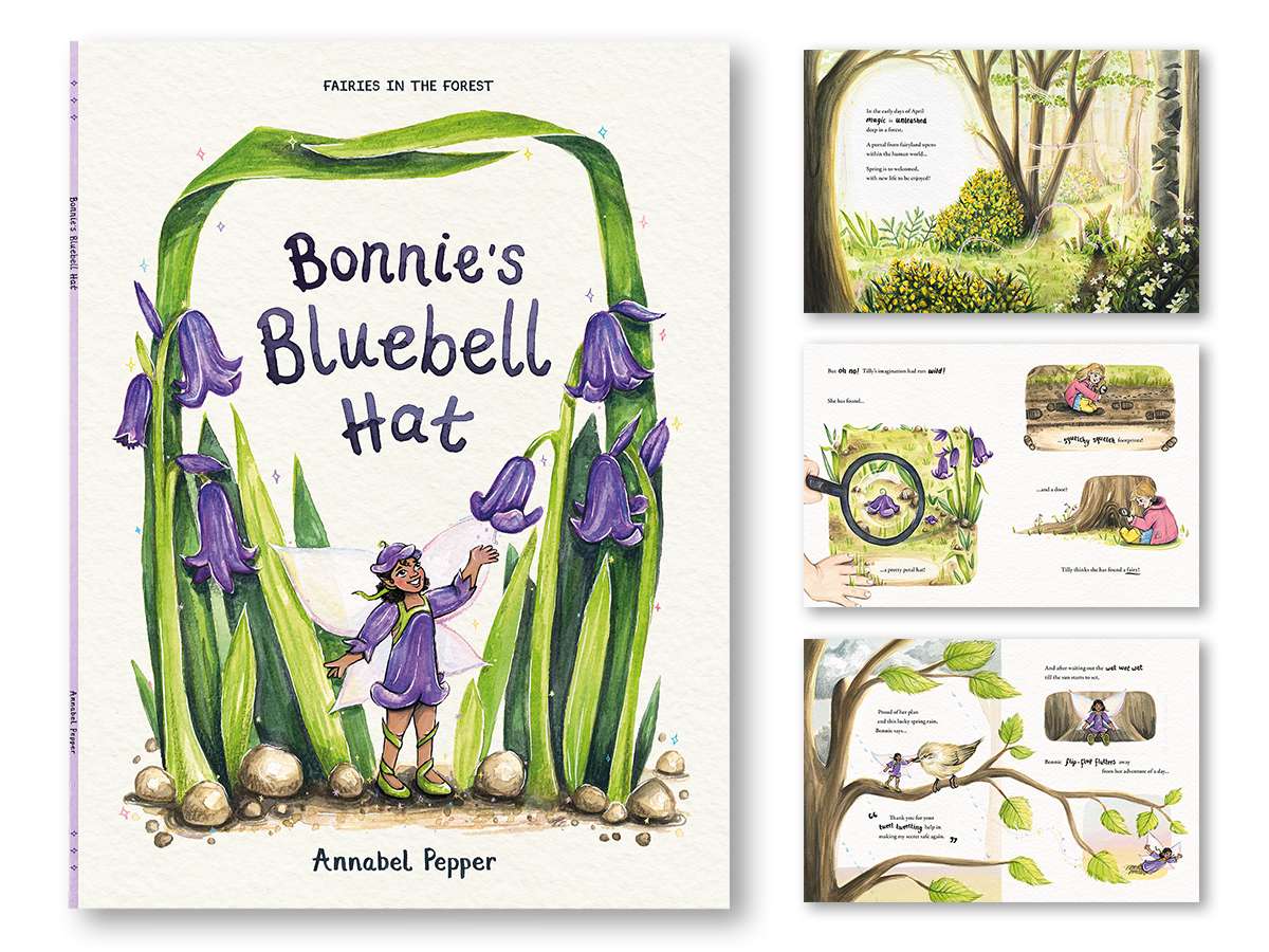
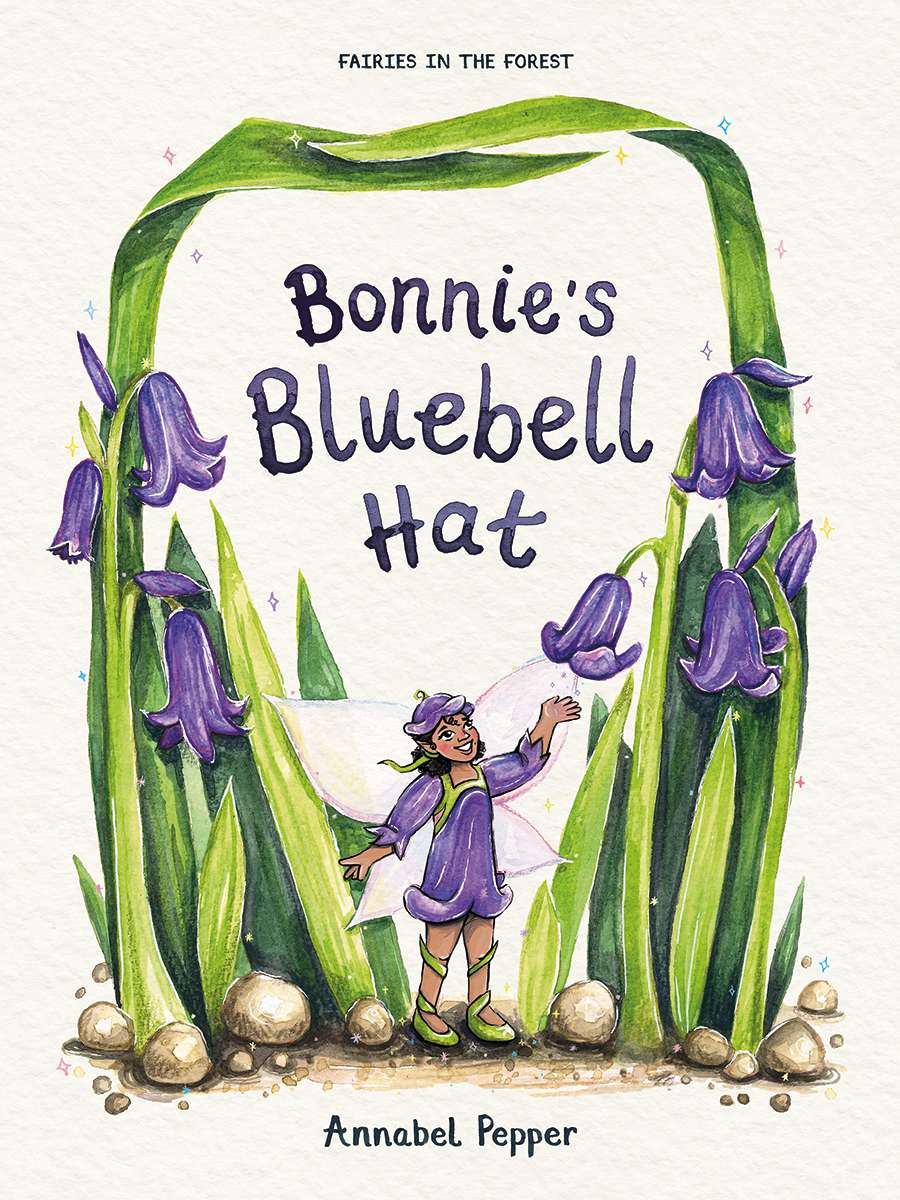
For my main Semester 2 project, I chose to create an original Children’s Picture Book.
Making a dummy book meant completing the final artwork and design for the front cover, title page, two spot illustration pages, and three spreads. The remaining pages I developed into refined roughs, so the story is easily read in full.
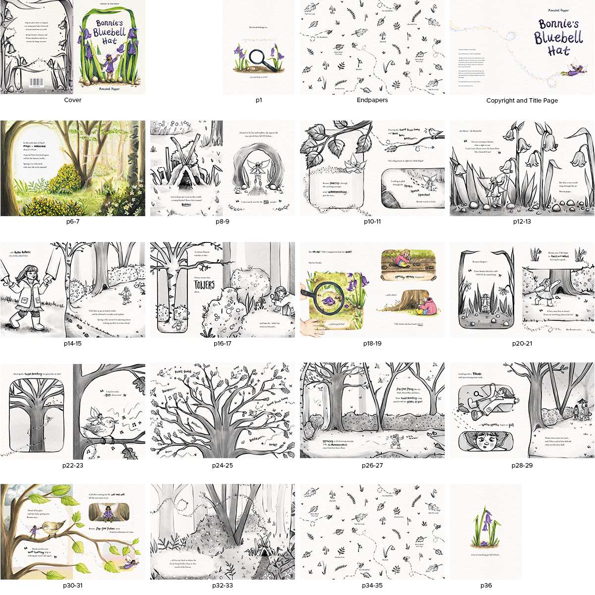
One rule all fairies must follow when roaming free in the human world is ‘…to not be seen by the big people!”
A bluebell fairy named Bonnie explores and enjoys a forest in the beginning of spring, but finds herself in an adventure to make this secret safe again after her lost petal hat is found by a curious child with a wild imagination and a wish to meet a fairy.
My underlying aim for the theme of this book is to encourage children to explore, enjoy and appreciate nature, developing their observational skills by noticing the large and small, and to let their imagination run wild. Spending time in nature, for both children and adults, has positive benefits including improving your wellbeing through exercise, stimulation, and imagination.
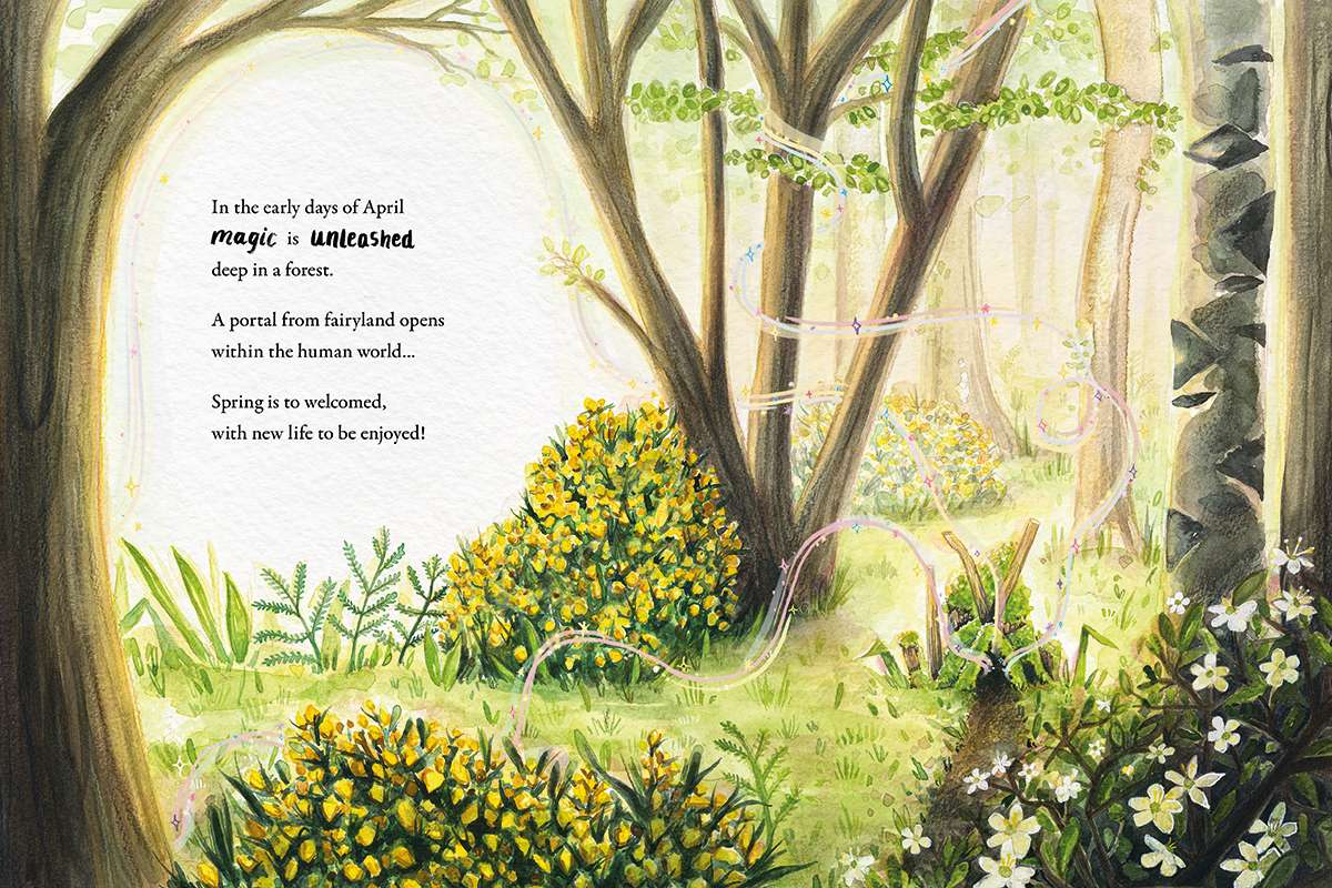
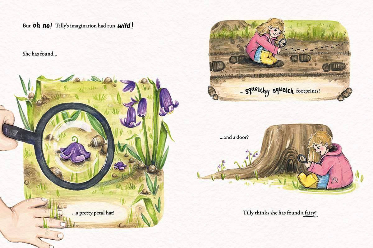
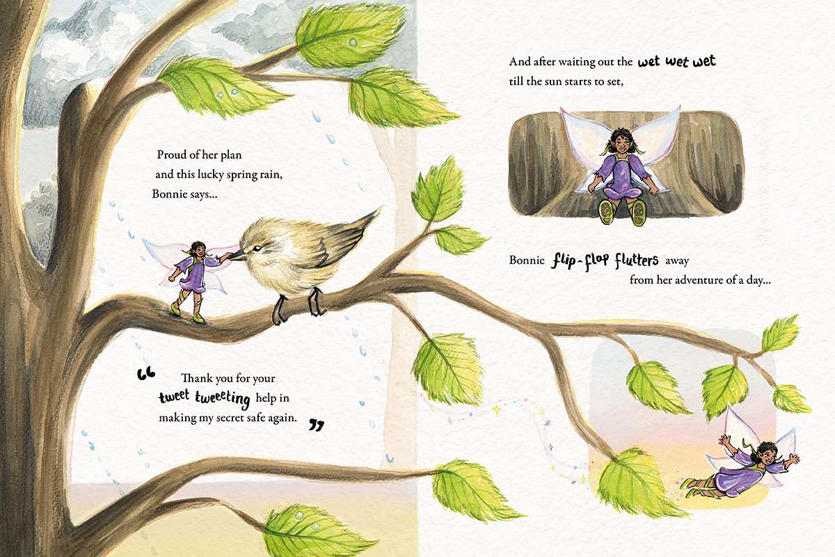
Mediums: illustrations and hand-lettering in this book were created with watercolour, gouache, fineliner, and coloured pencil, with digital editing in Fresco and Photoshop.
Book Dimensions: 210 x 3 x 280 mm

As a shorter project in Semester 2, I entered the Penguin Cover Design Award. I redesigned the cover for the children’s book ‘City of Stolen Magic’ by Nazneen Ahmed Pathak.
The story is about a young girl who has a powerful magic and must travel from India to London to save her mother who was kidnapped.
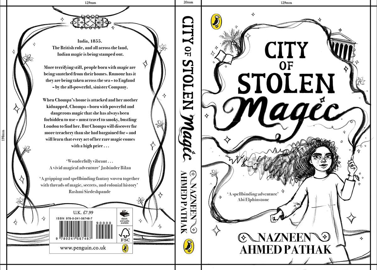
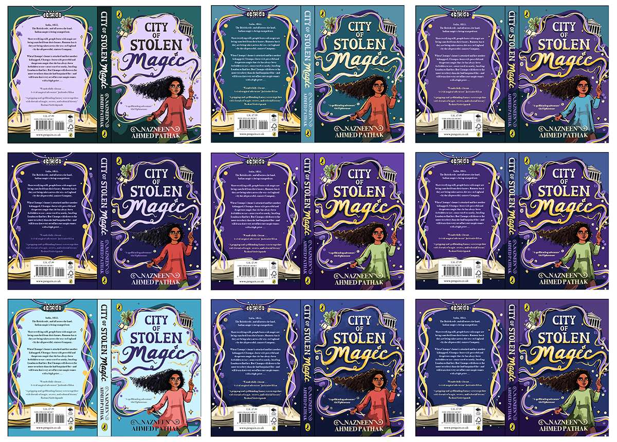
In this project I wanted to focus on the connection between picture and type.
Illustrating the title and author name in watercolour and editing digitally, allowed me to so this. A key decision for the hand-lettering of City of Stolen and the Author Name was for the shape to resemble the pillars of The British Museum (a key location within the book). Another was for the Magic to be connected and flowing through the illustrated magic lines.
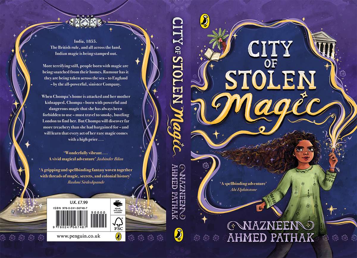
Medium: The illustrations were created digitally in Adobe Fresco, with the hand-lettering and texture/pattern details painted in watercolour and edited digitally to merge seamlessly.

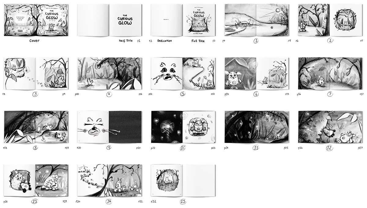
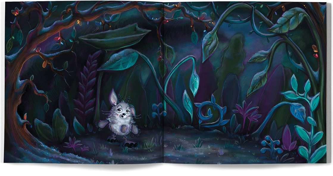
My first project in Semester 1 was an original wordless children’s picture book titled ‘The Curious Glow’.
A curious young creature follows a glow into the wood, but gets lost when the it disappears. Scared of the dark and shadows the creature ends up falling in fright, but opens its eyes to find a glow cover shadow. The figure steps out and reveals to be their parent who had been following them all along.
Book Dimensions: 8.5 x 8.5 inch
Medium: illustrated digitally in Adobe Fresco

My second project in Semester 1 was an editorial illustration based project titled ‘Help Your Mind’.
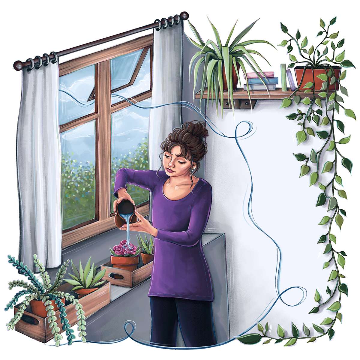
Using an article by The Mental Health Foundation – ‘What can we do to cope with feelings of anxiety?’ – I visualised chosen sections of the written information, with an aim to make it easier to for the audience to understand, digest, and connect to it.
Coping Mechanism Subheading:
‘Spend Time in Nature’
Summary: Connecting and immersing yourself in nature can help your wellbeing by making you feel calmer and less stressed.
