
Amy Joy Newcombe
I am a weave specialist and love to innovate with bold colour palettes and 3D designs. I enjoy pushing the boundaries of the loom with multimedia designs that communicate individual experiences and address social needs.

I am a weave specialist and love to innovate with bold colour palettes and 3D designs. I enjoy pushing the boundaries of the loom with multimedia designs that communicate individual experiences and address social needs.
Final Project
Inspired by my own experience of hearing loss, ‘Sound in Motion’ is a visual representation of the varying auditory experiences faced by the Deaf Community. The installation serves as a visual aid to help the hard of hearing describe their unique experiences of hearing loss and tinnitus.
The collection offers the added practical solution of a considered interior space that minimises sensory overload and eye fatigue for those carrying assistive hearing devices where background noise is difficult to tune out and reliance on visual ques such as lip reading or sign language is often crucial.
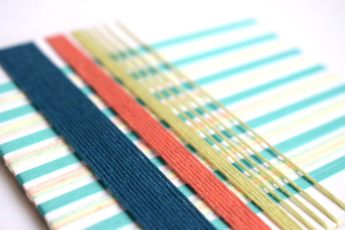
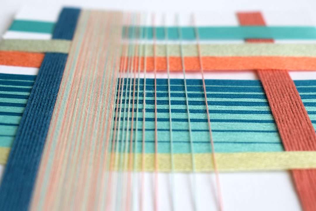
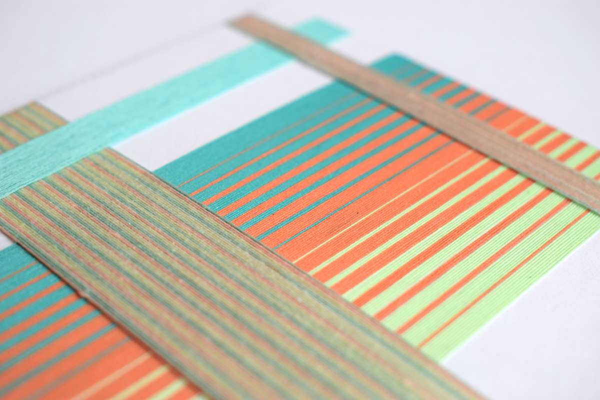
Making paper weaves and yarn wraps form a critical part of my design process. I use acrylics, gouache paint and yarn to measure colour proportions, build a strong colour palette and experiment with woven composition at a smaller scale.
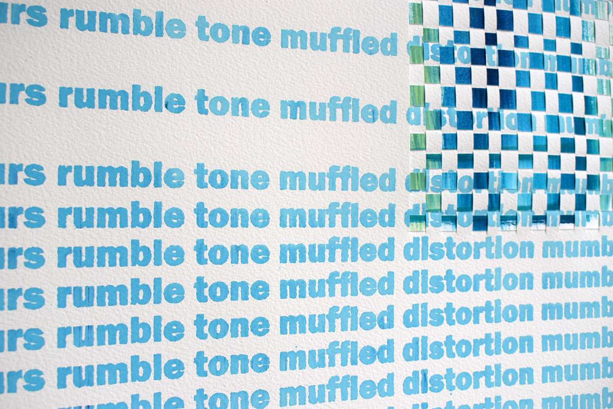
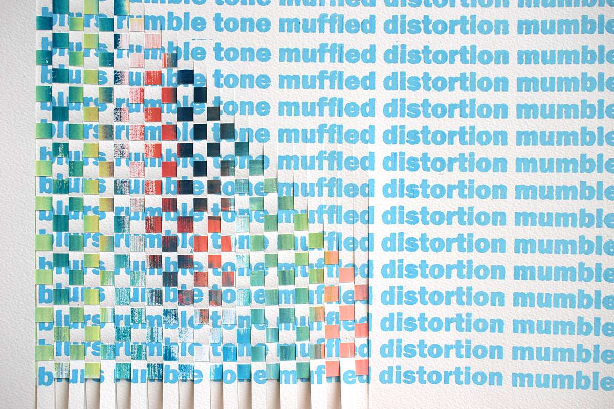
Gouache and pigment paint screen print on card, Paper Weave A1
These yarn wrap samples allowed me to experiment with a spliced weft to form an ombre through woven structure as well as through dip dyed and painted warp yarns.
‘Distortion‘ and ‘Electricity‘ are the two foam sound panels in the collection, made from a digitally manipulated and distorted text and woven using a jacquard loom. The panels serve as a sound absorber for urban interiors to minimise sensory overload for people carrying assistive hearing devices.
‘Distortion‘ features text taken from a survey I have undertaken that are commonly associated by the hard of hearing to describe the deaf experience eg. ‘blurs, mumble, tone, muffled, distortion, mumble…
“I find it more difficult in loud environments, can’t identify direction of noise, noise is distorted.”
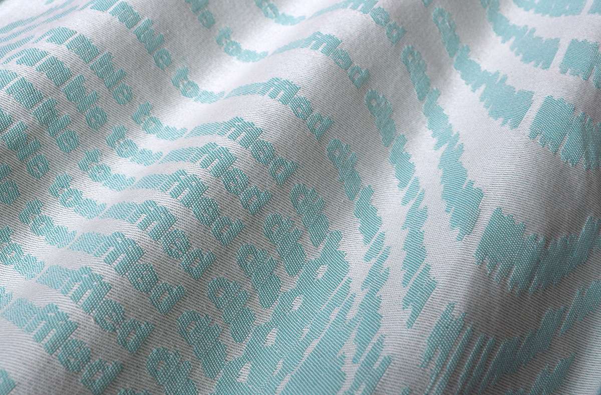
‘Distortion‘, Jacquard design on foam
The second sound panel, ‘Electricity‘, is inspired by a participants experience of how it feels to have tinnitus, which is resembled in the manipulation of the stretched out distorted text.
“Like electricity going from ear to ear…“
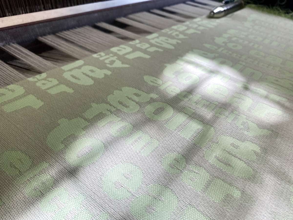
‘Electricity‘, Jacquard design being woven on the loom
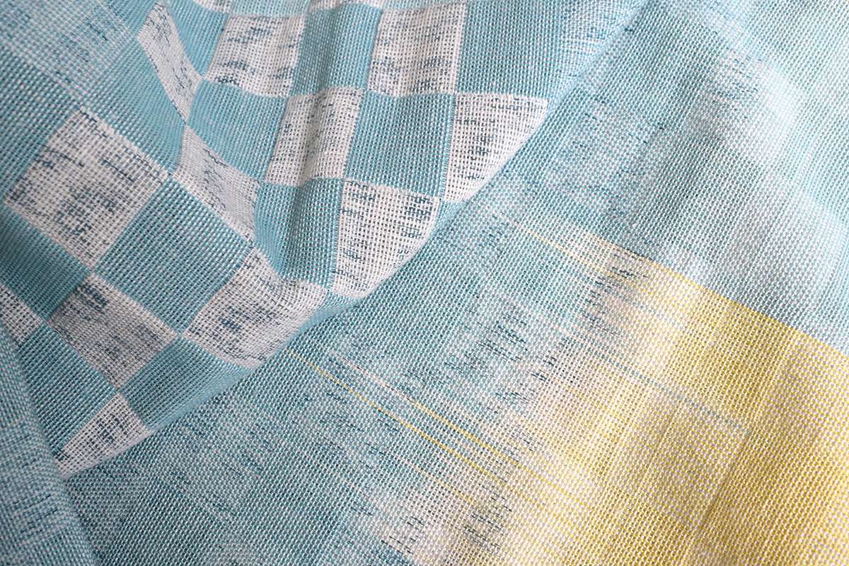
These handwoven chequerboard art pieces are made from a sectional dip dyeing processes to create ombres throughout the warp which reflect the concept of faded hearing at higher or lower frequencies.
As well as dip dye, both pieces also feature screen printed text. The designs are the the result of extensive experimentation with an unconventional approach to screen printing, using a modified pigment paste to print text onto the warp, ultimately revealing a subtle, distorted text once woven. This is a technique I had not seen done before and was a fascinating process, exploring how print techniques could work in tandem with weaving to better visually communicate the concept of hearing loss.
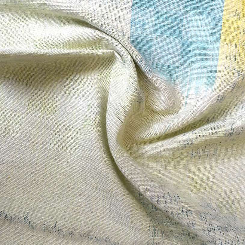
The composition and chosen lifting plans of each piece is also considered to reflect the varied experiences of the hard of hearing. For example, where the chequerboard design is woven as a bold double cloth structure in the second artwork (below) represents the overall results of the survey that most participants have strong mid range hearing but struggle to hear high or low frequencies.
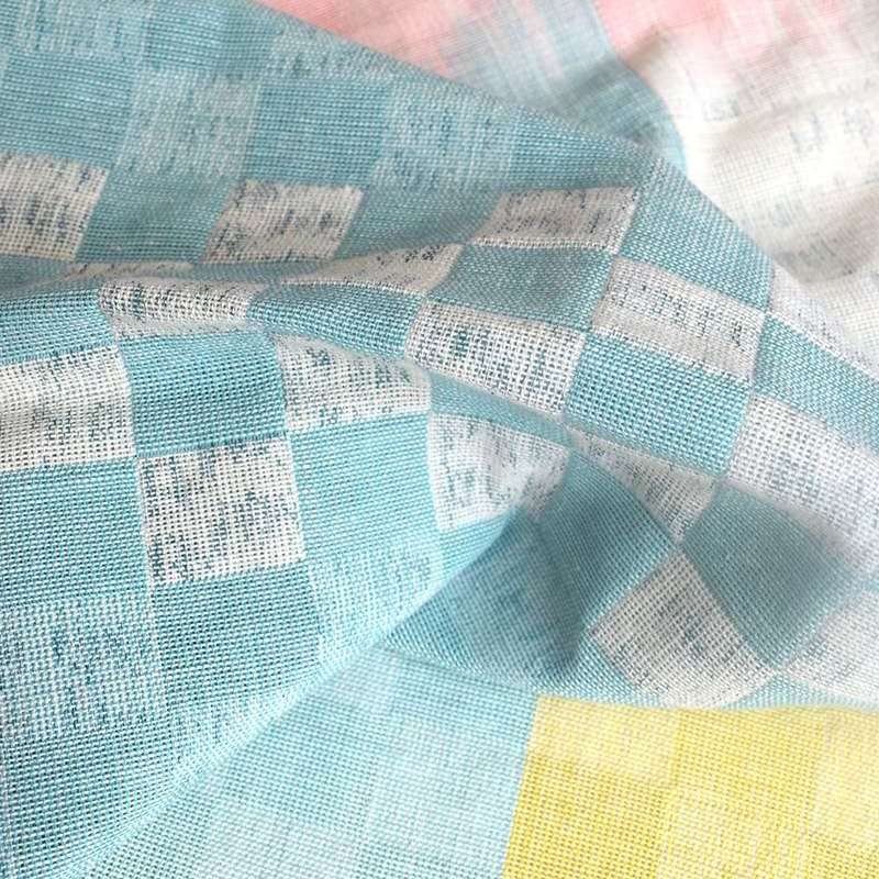
Double Cloth Hand Woven Cheque Artworks 1&2 – Screen Printed and Dip Dyed warps
‘It Comes In Waves’ is a digitally woven jacquard structure, inspired by the experience of tinnitus as background noise which ‘comes in waves…’. Hand pleated and heat manipulated to form a 3D origami fold out screen, this piece can serve as an adjustable backdrop; to create an enclosed environment for one-to-one conversations, eliminating background distraction and as a sound absorption screen.
“Generally I avoid sensory overload or distractions… I find it virtually impossible to understand speech in loud situations”
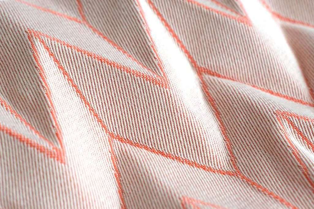
Heat manipulated & pleated jacquard
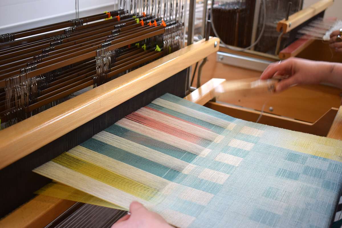
Sample being woven on the loom, 24 Shaft ARM Loom