Megan Taylor
I am a graphic design graduate with a strong interest in illustration and animation and enjoy finding new ways to learn from the world around us.

I am a graphic design graduate with a strong interest in illustration and animation and enjoy finding new ways to learn from the world around us.
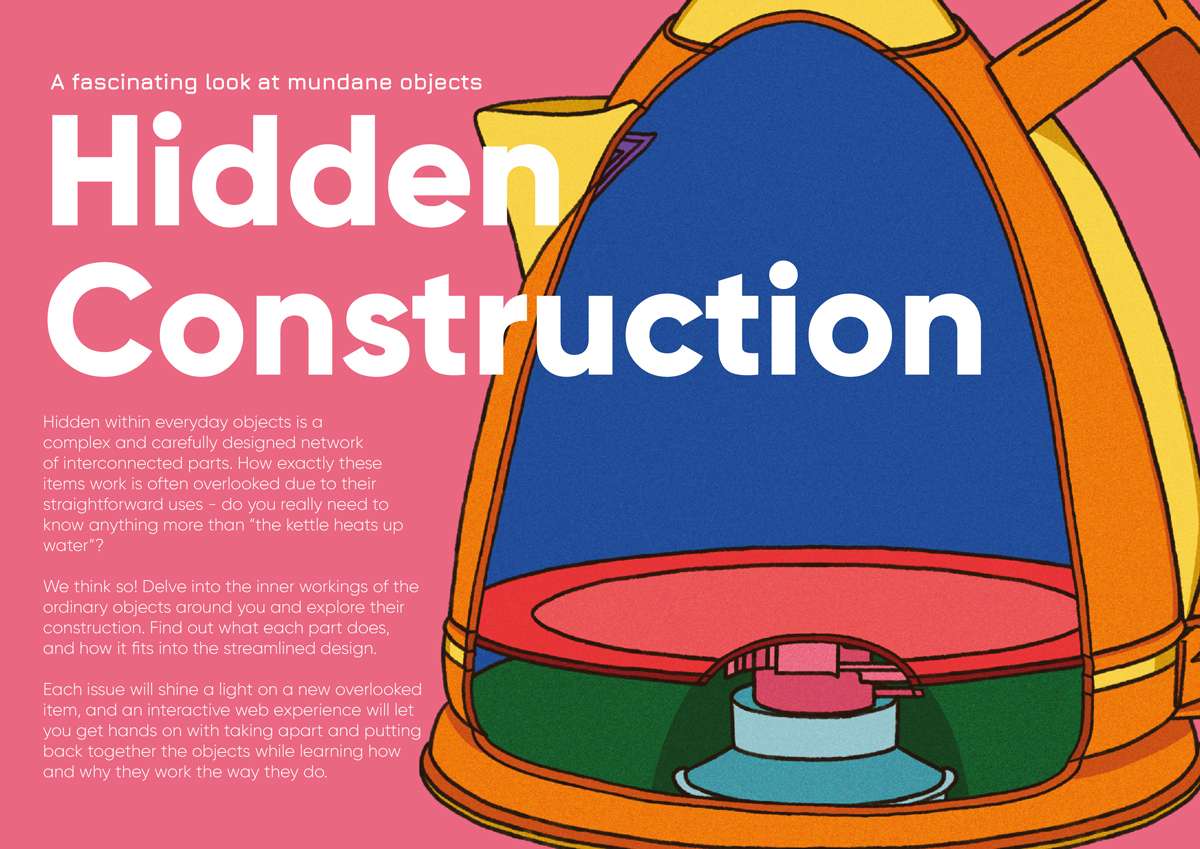
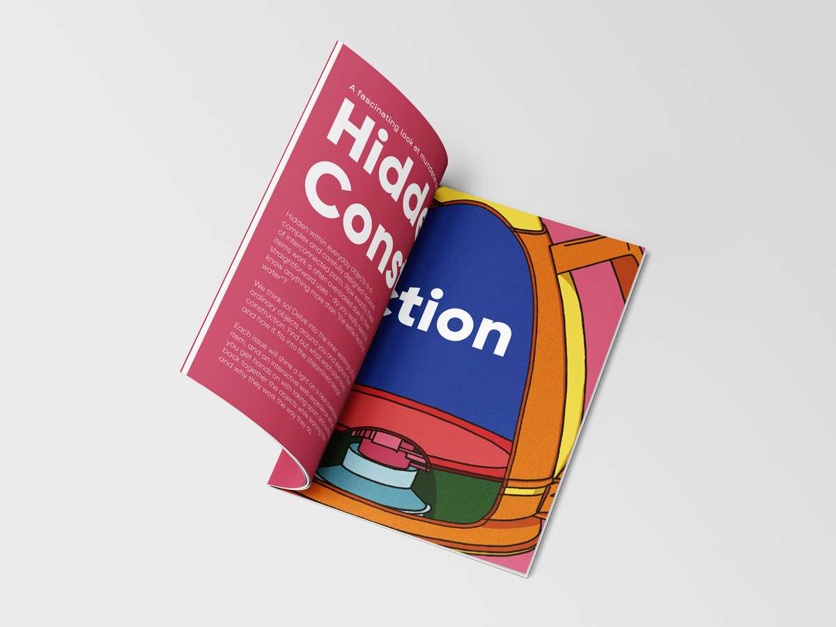
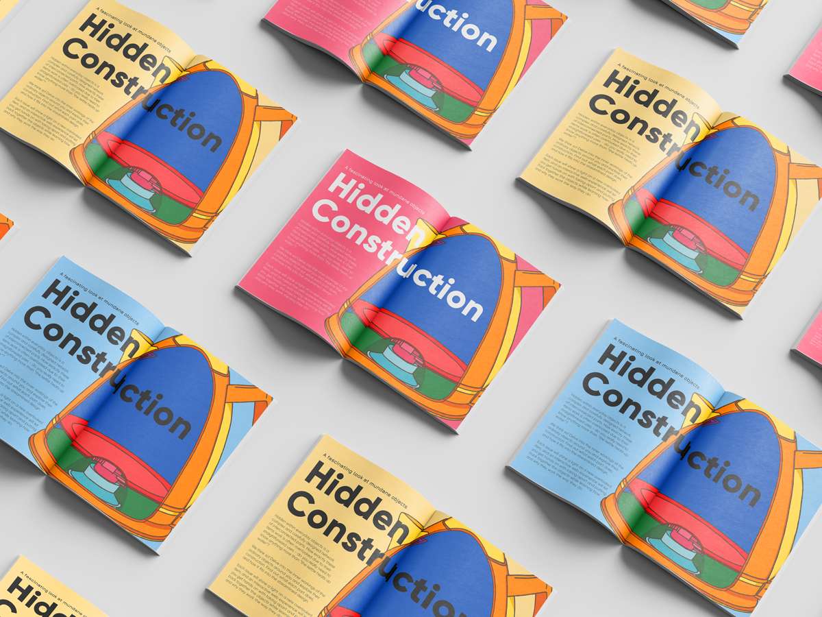
There are many objects, tools or devices that we use in our daily lives and never consider how they are made or how they work. They are so common place and accepted that there is no reason to learn about more than their general purpose.
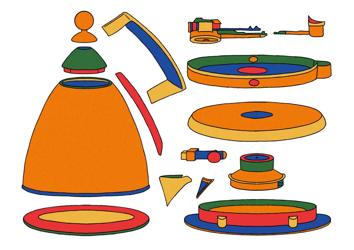
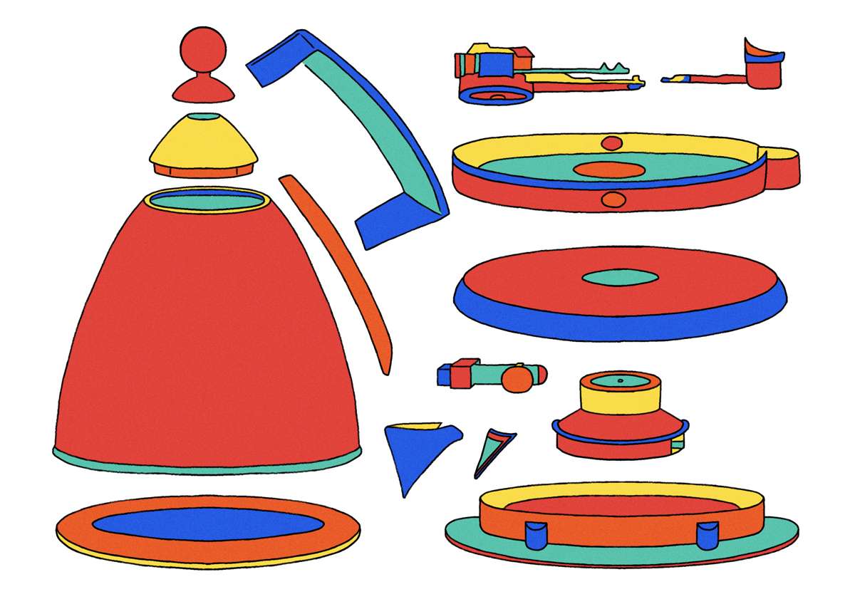
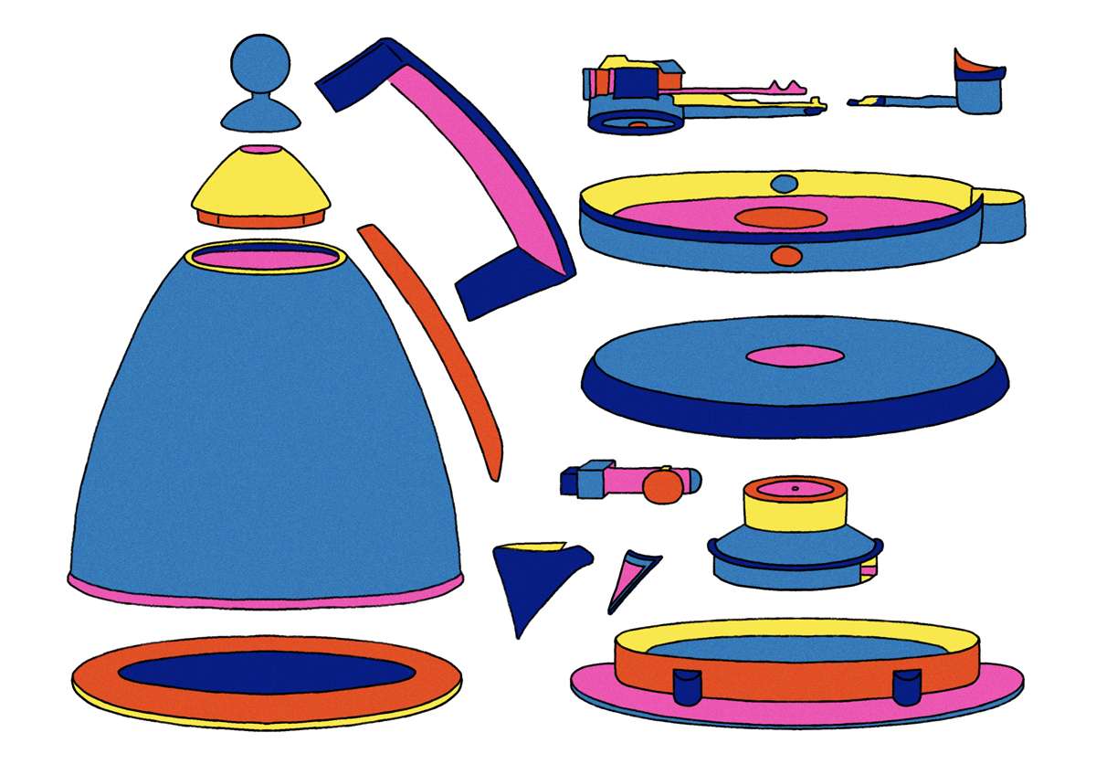
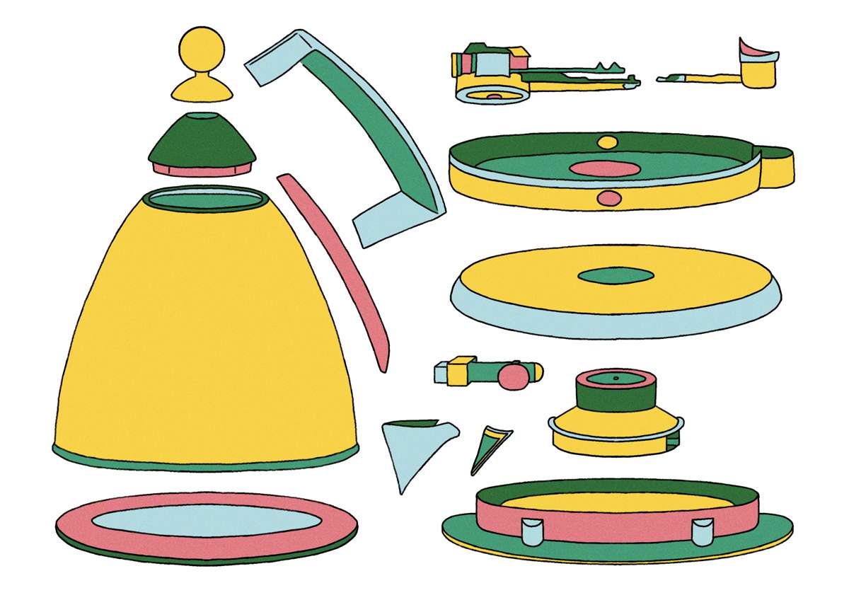
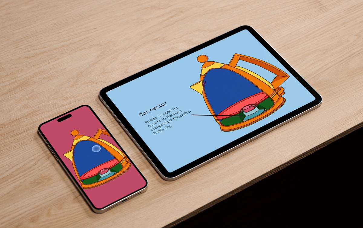
This project hopes to ignite an interest in the construction and design of these objects through a combination of visual deconstructions, detailed internal views of the components and how they work together, and interactive media online where users can get hands on with taking apart and reassembling the object of the week.
Use of bright, limited colour palettes and simple presentation of shapes aims to make the process of learning more appealing and easier to follow along for both children and adults alike.
A hybrid approach of physical magazine and online companion website is in place to work with different types and preferences of learning, providing options for an experience that best suits each user.


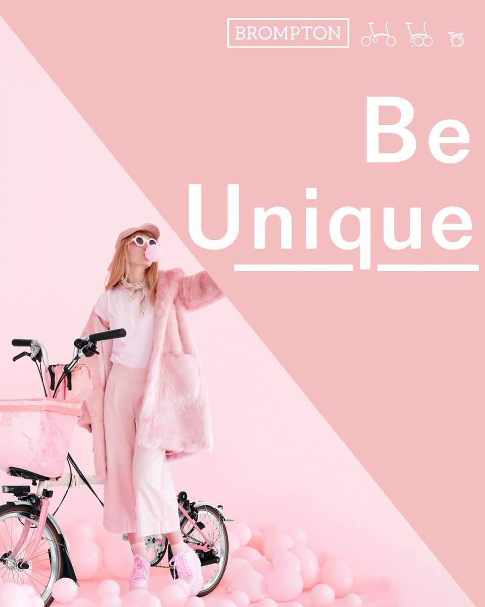

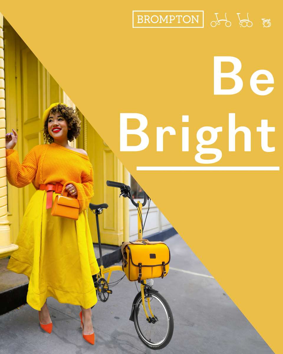
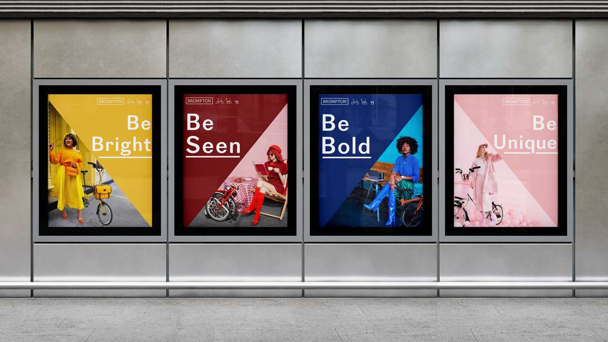
A series of animated advertisements for the folding bike company Brompton.
Prompted by the product’s incredibly versatile design and wide range of customisable options, this series of advertisements aims to highlight this aspect of the item to appeal to customer’s desire for something unique and personal.
The bike’s portability and ease of use both with city living and commutes, as well as rural road trips is well known and featured strongly in the brand’s existing marketing. The personalisation side of the product has found its way onto their social media recently, though is not as prominent in their advertising overall.
This project hopes to help fill that gap and draw in new interest in the company and product.
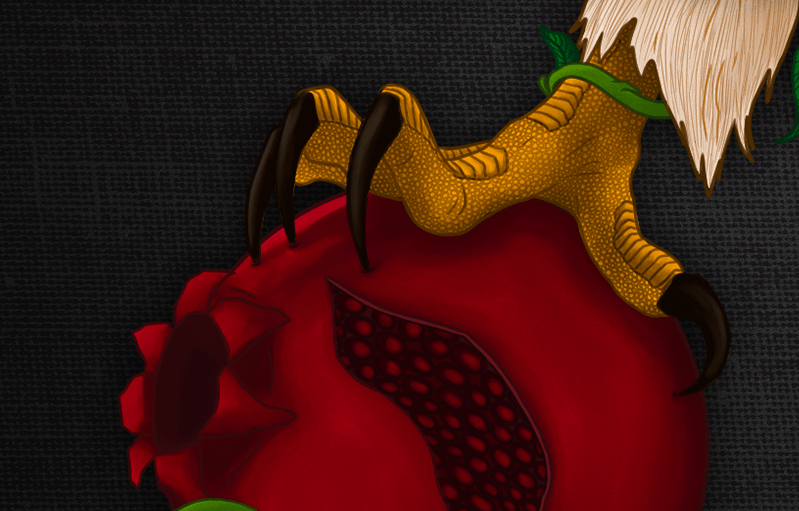
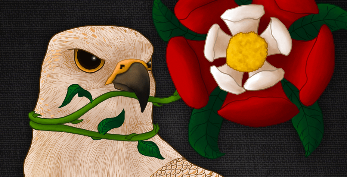
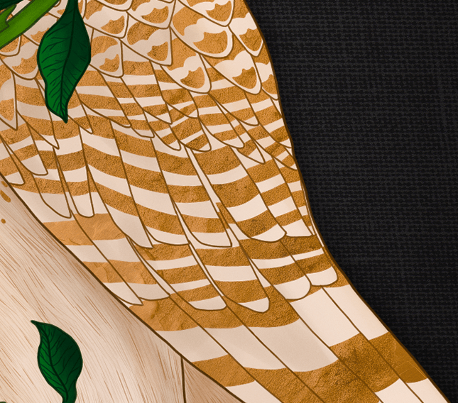
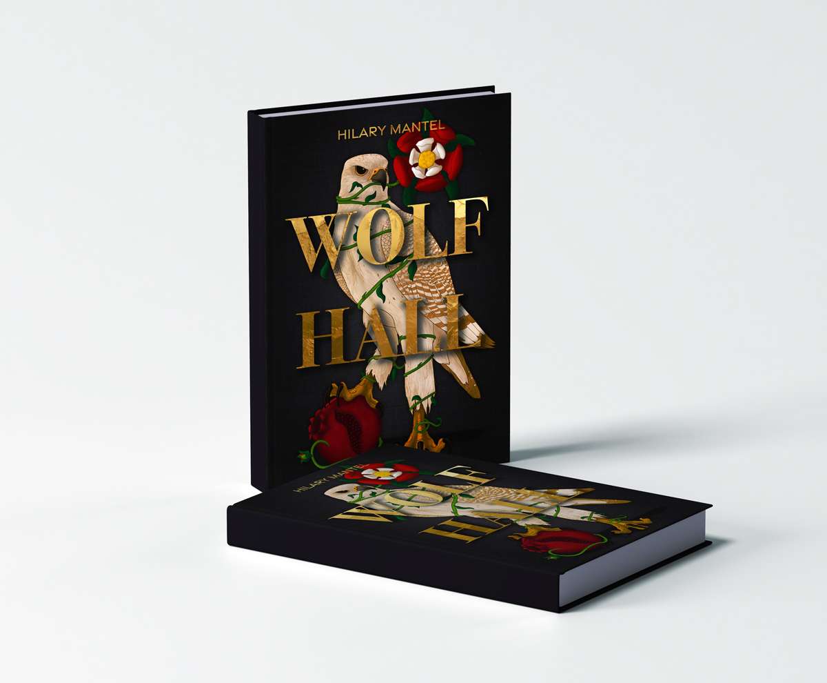
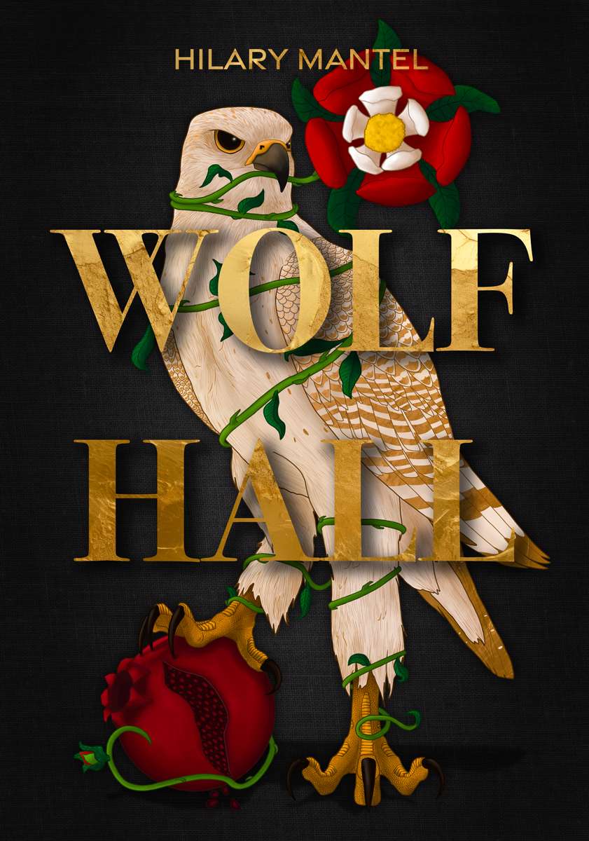
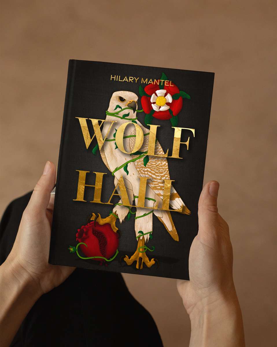
Taking a look at Hilary Mantel’s historical novel “Wolf Hall” – which follows Thomas Cromwell’s rise to power during the Tudor era – with the aim of redesigning its cover to both appeal to a younger adult audience and reflect more of the story and character driven plot.
Unlike the existing covers, this redesign attempts to allude to the events surrounding the main character, Henry VIII’s divorce of Catherine of Aragon and marriage to Anne Boleyn, with the two Queen’s emblems making up the illustration.
