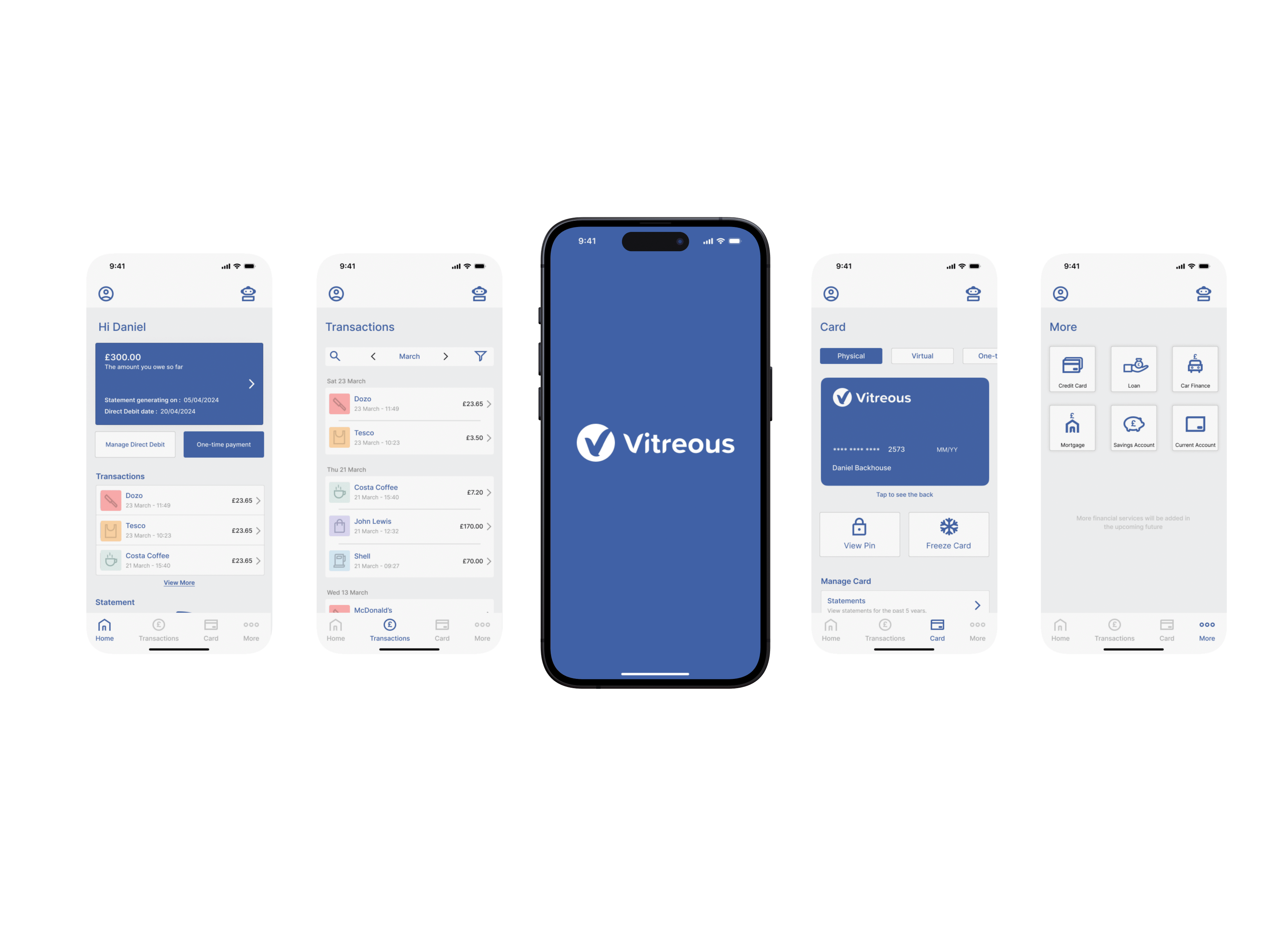
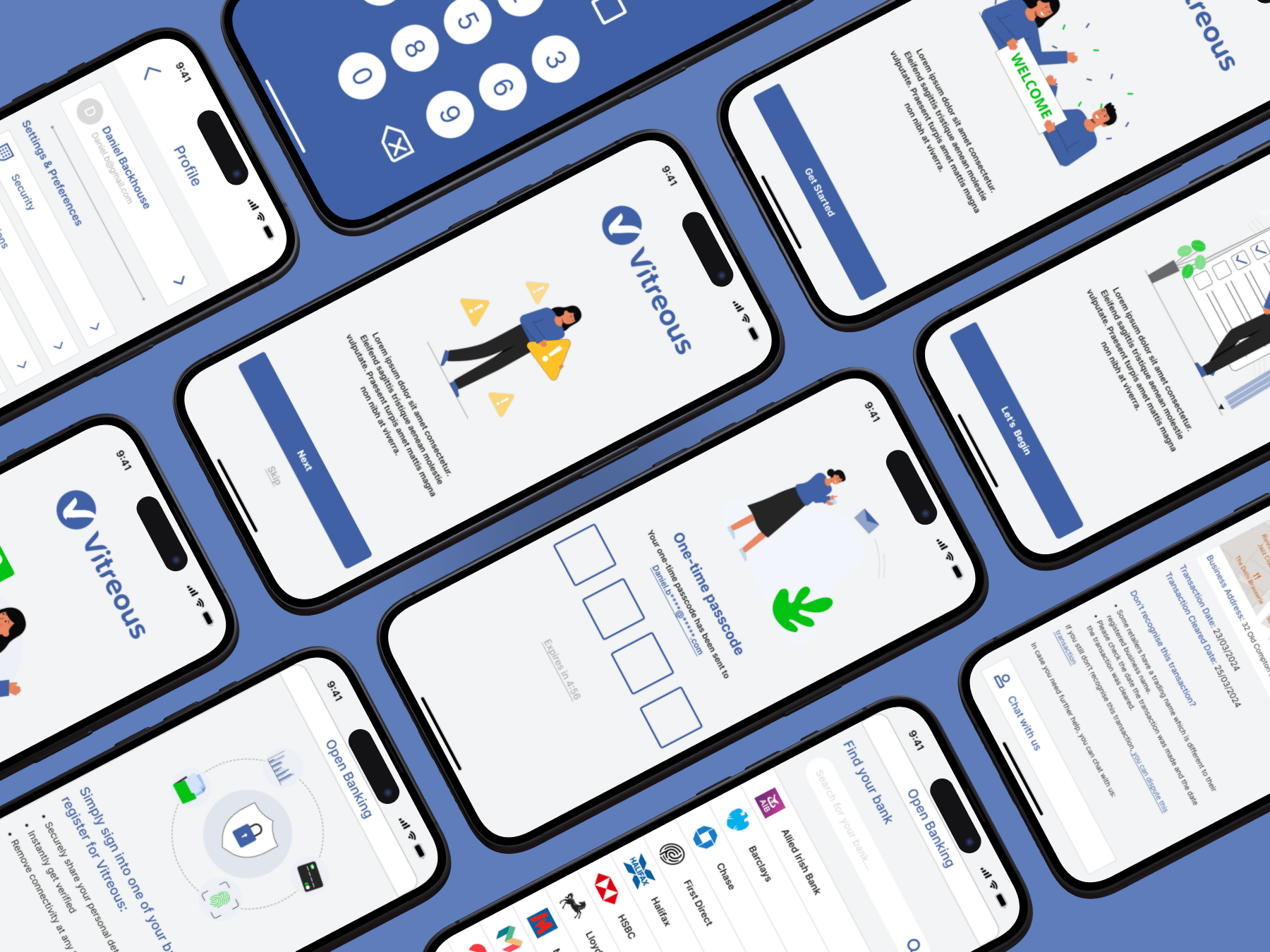
I'm Bardia, a design student at Loughborough University, I have a diverse background in various design disciplines. Having explored various design paths during my academic journey I have decided to focus on UI/UX for my third year at Loughborough University.
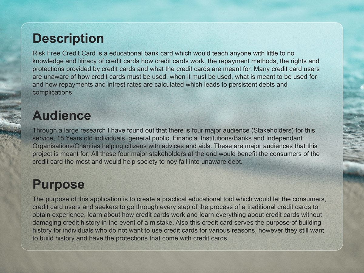
Vitreous, a cutting-edge mobile app, is revolutionizing the credit card journey. It’s designed to eliminate financial risk for those new to credit cards or seeking to build a credit history. Unlike other apps, Vitreous simplifies the complex world of credit cards, providing clear explanations of terms like Annual Percentage Rate and repayment methods.
Vitreous is not just a credit card; it’s a financial literacy tool. It ensures responsible spending by limiting purchases to the funds in the user’s current account. With a personal bot guiding them, users can ask any question about credit cards and receive clear, educational explanations.
As consumers cannot get into debt with Vitreous Credit Card, they can practice the “theory” they have learnt within the app practically and, on the way, build their credit history and benefit from the protections credit cards provide. Most importantly, if they make a mistake, it won’t affect their financial history, and the bot will tell them where they have made a mistake and explain that topic to them so they can learn from their mistake.
This application is not only for individuals new to credit cards but also for people who want to build their credit history without going into debt. Vitreous will report balance amounts to major credit agencies such as Experian, Equifax, and TransUnion. Unlike traditional credit cards, Vitreous will never report information that can have a negative impact on the user’s credit report, as any mistake in using Vitreous is learning and gaining experience without risk.
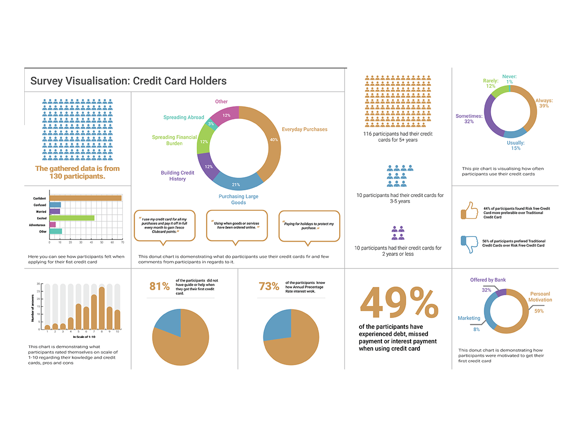
Here, you can see the data visualization I designed using the data I gathered through 130+ responses from various channels such as social media, word of friends, family and networks.
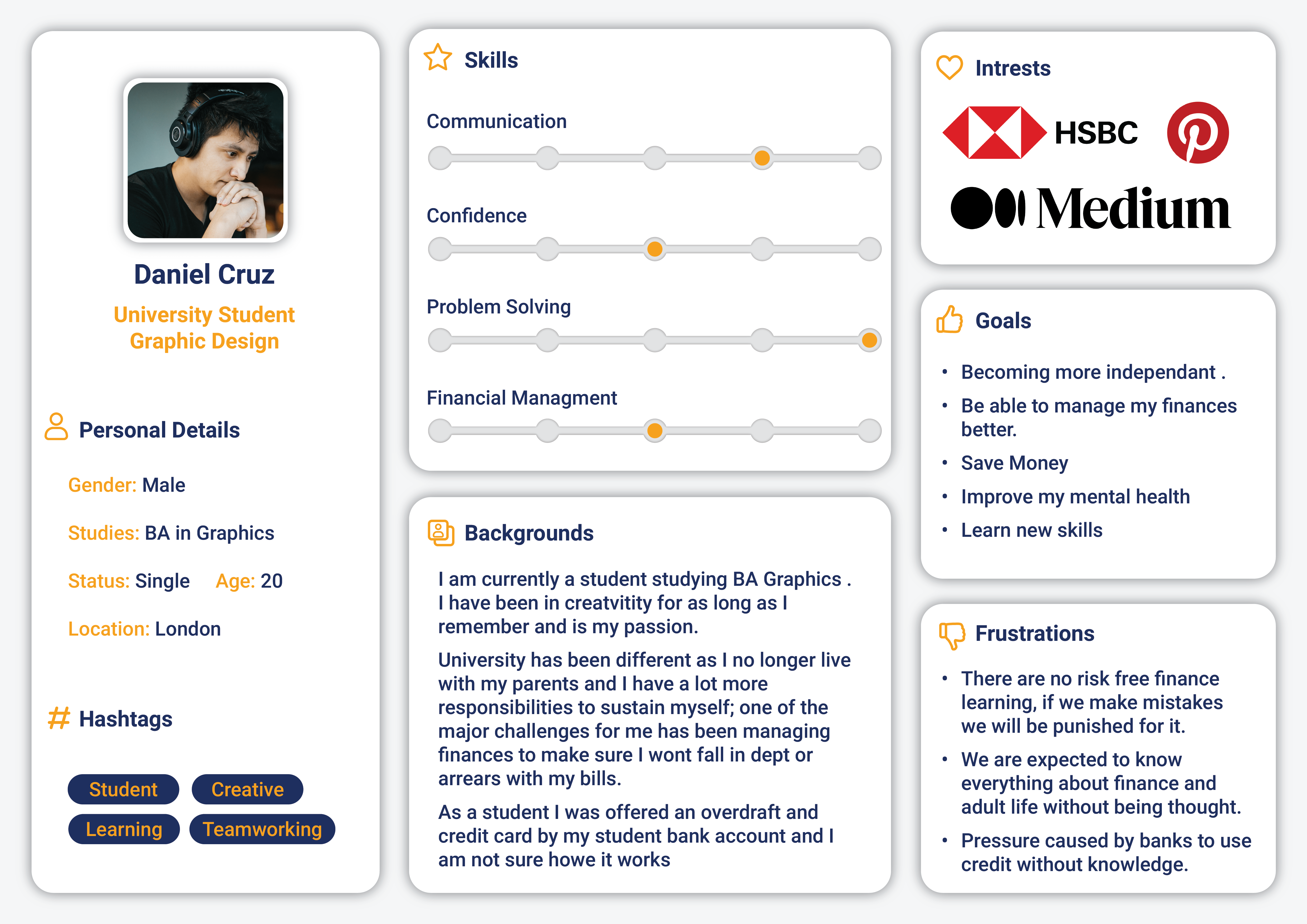
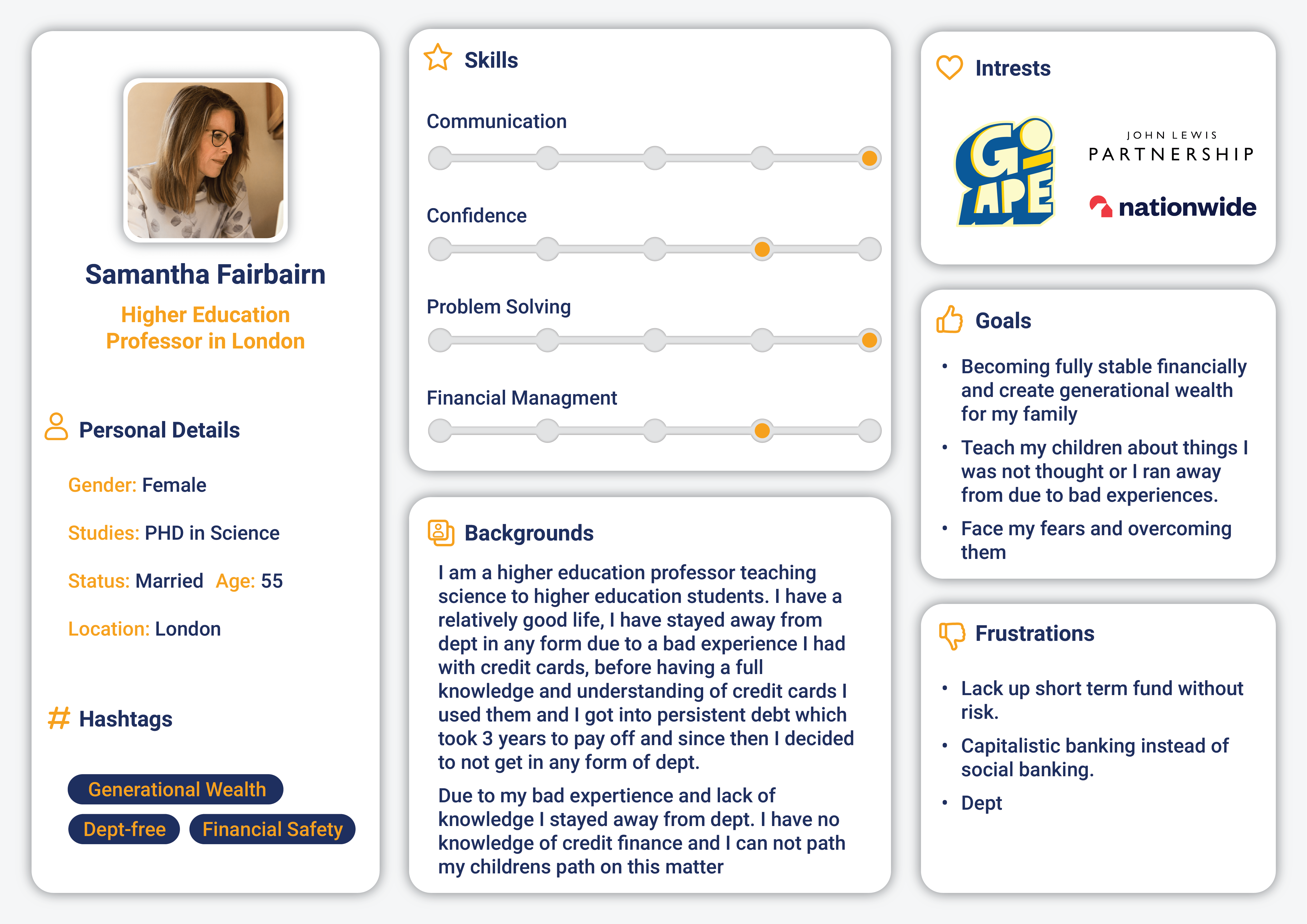
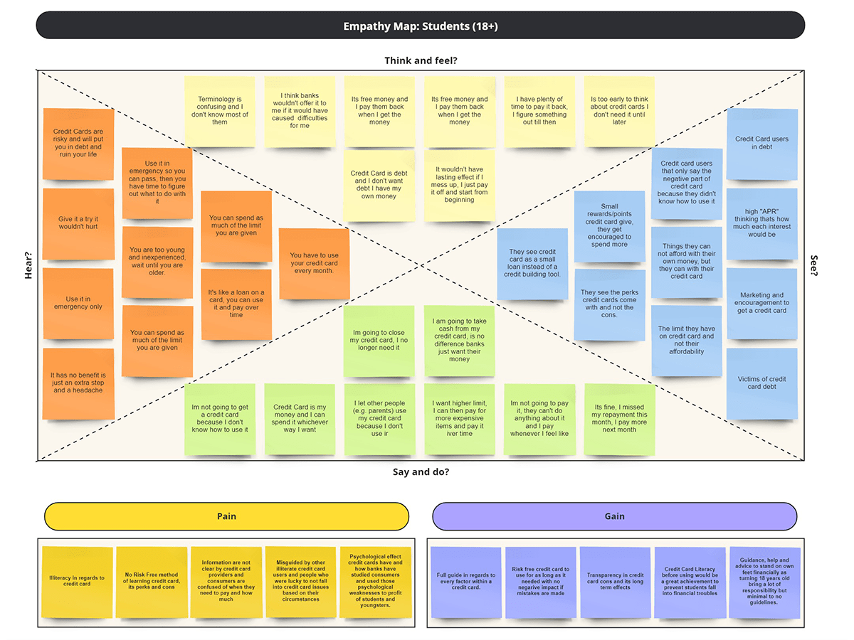
I have created three empathy maps for three stakeholders of my project, one of which you can see here. Doing this helped me understand my users’ needs and design a user-centred design.
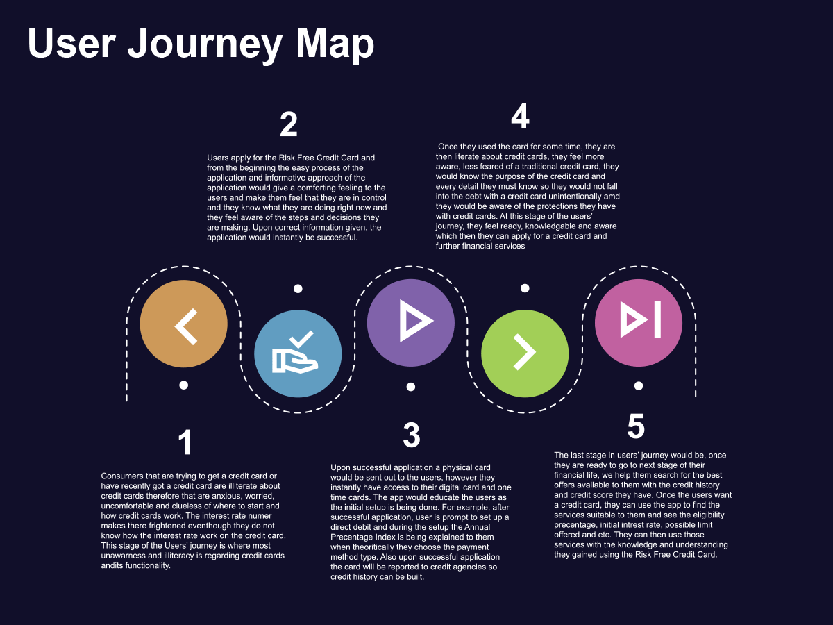
I have also produced a user-journey map, pathing the journey of users who need Vitreous take from beginning to end and beyond.
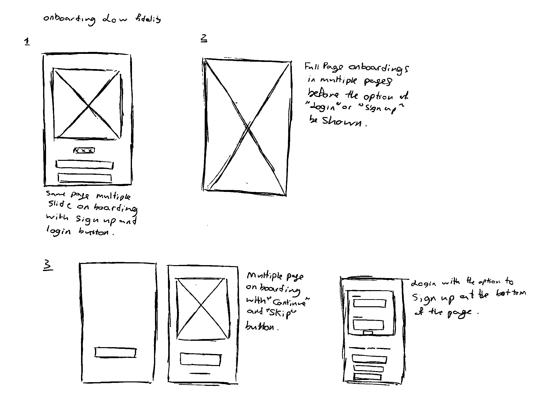
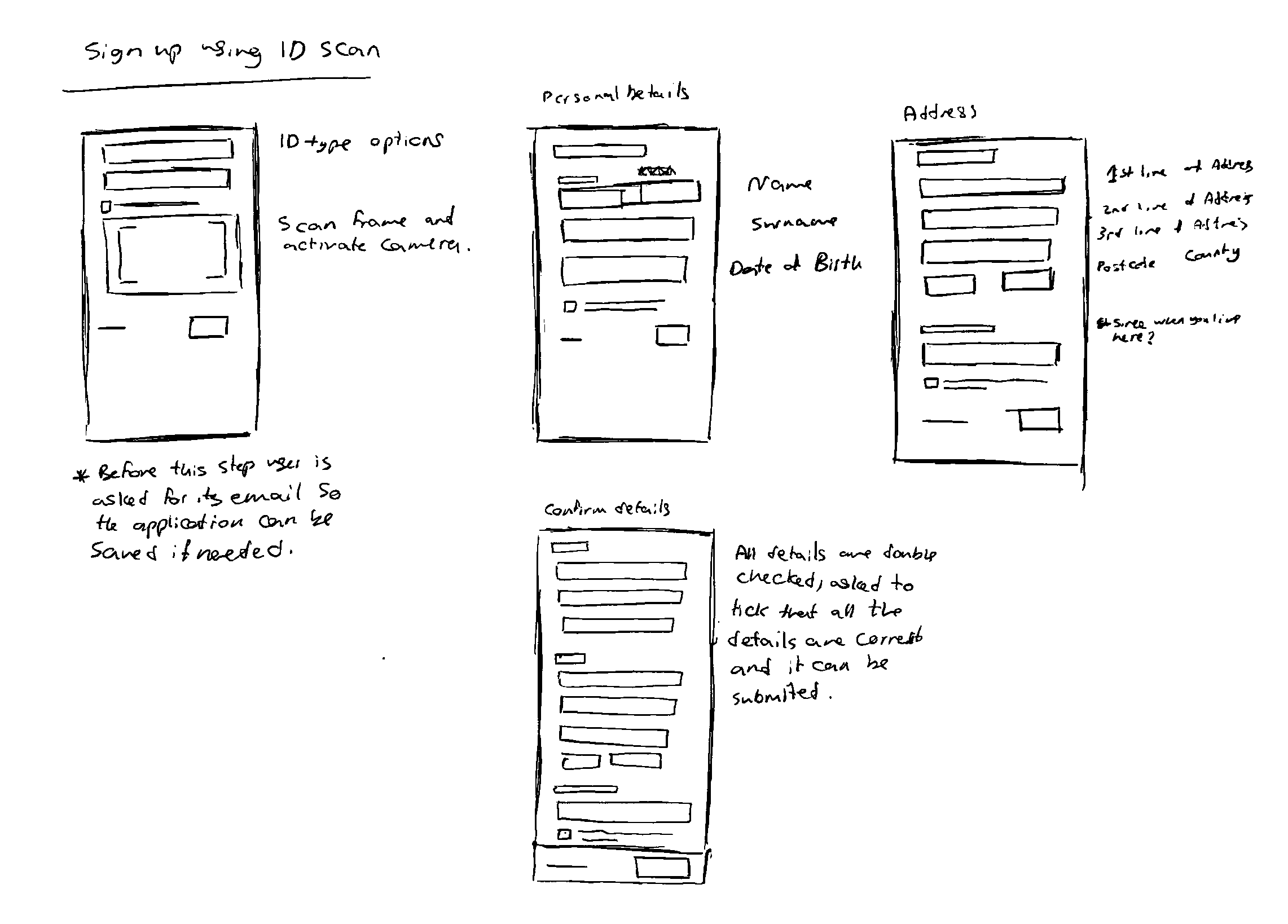
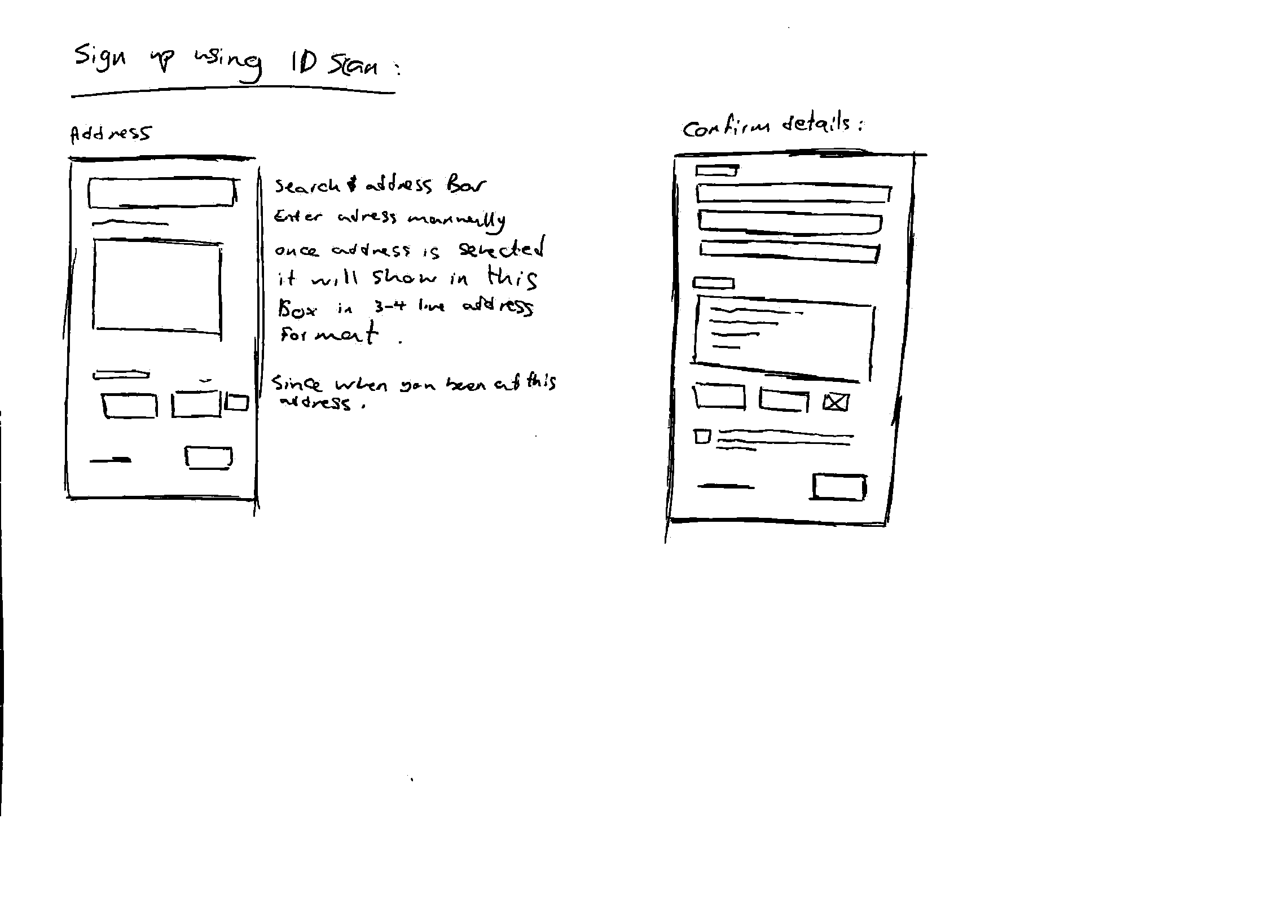
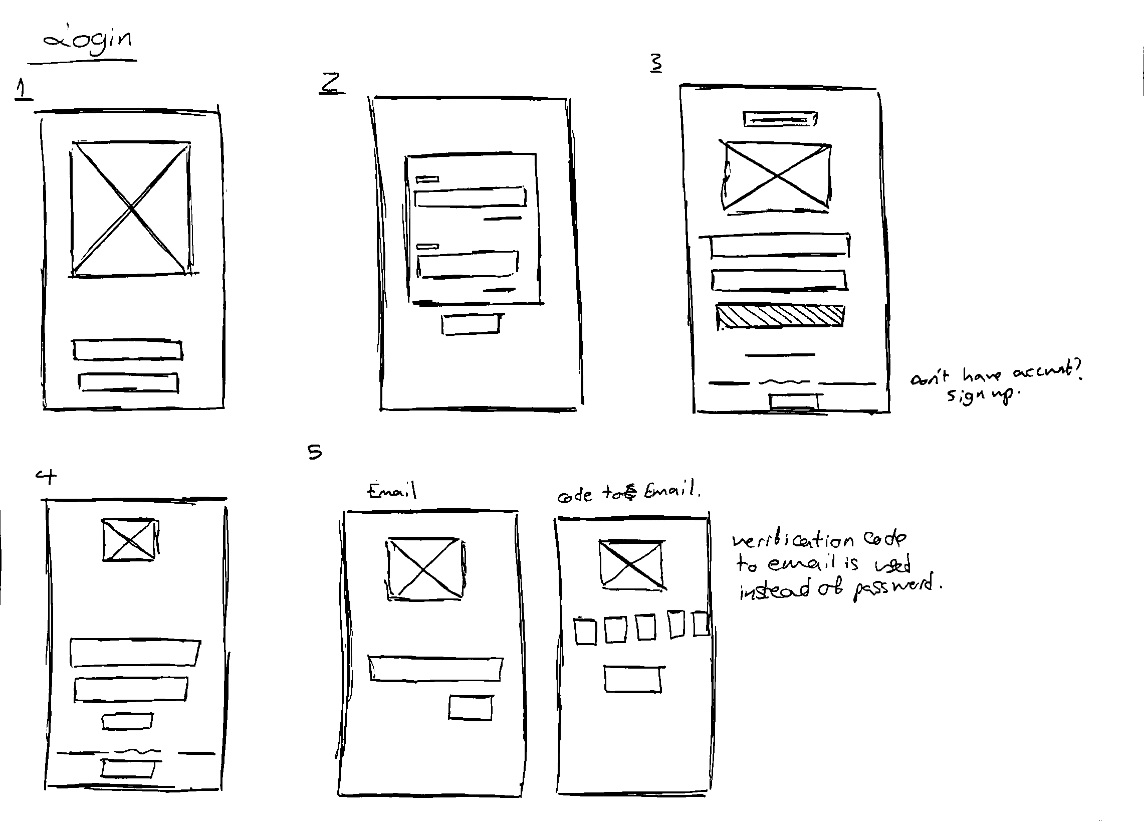
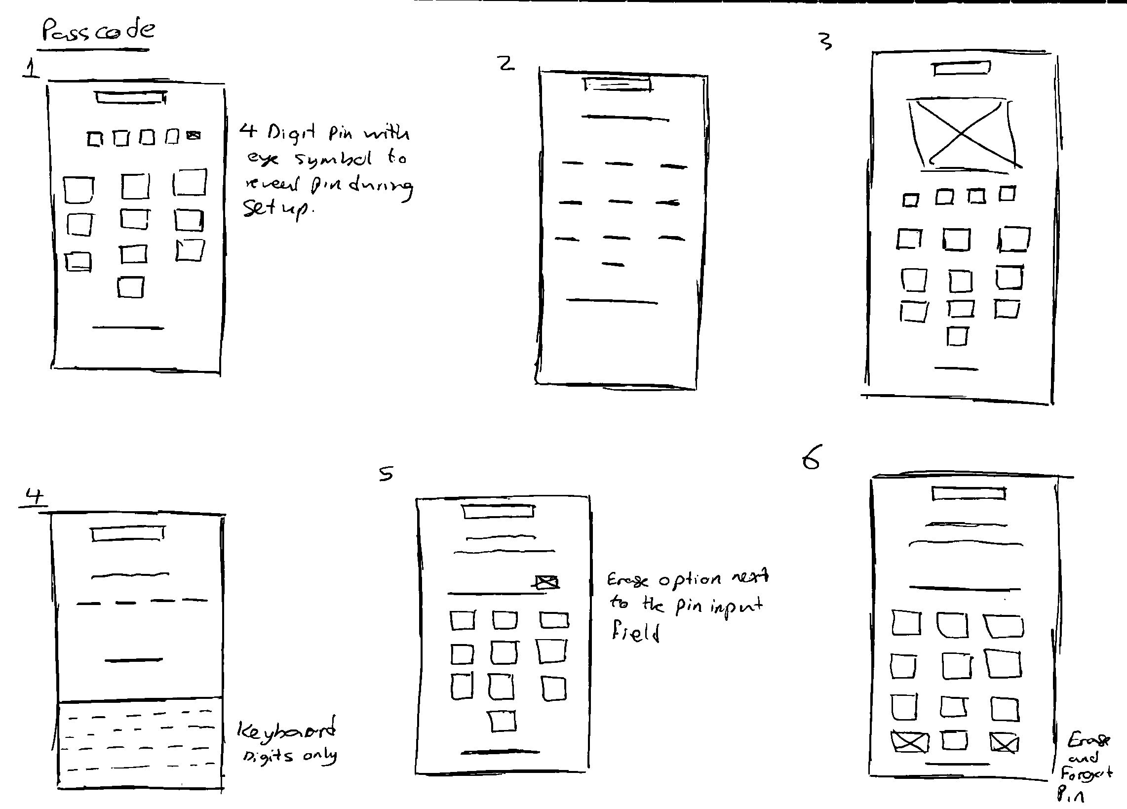
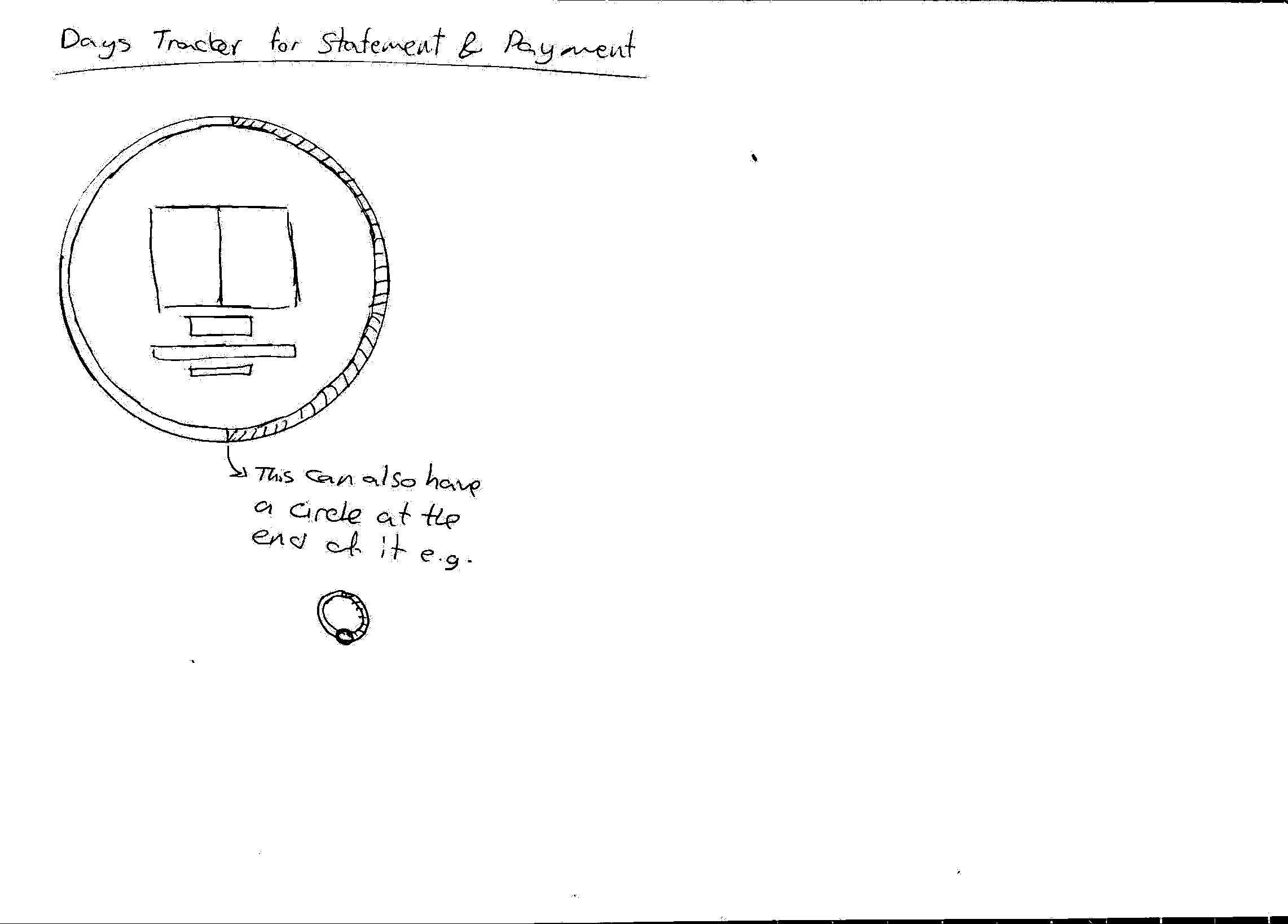
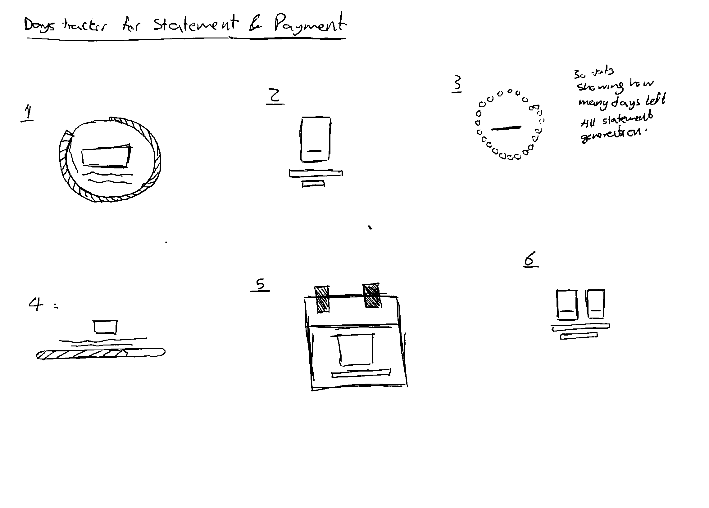
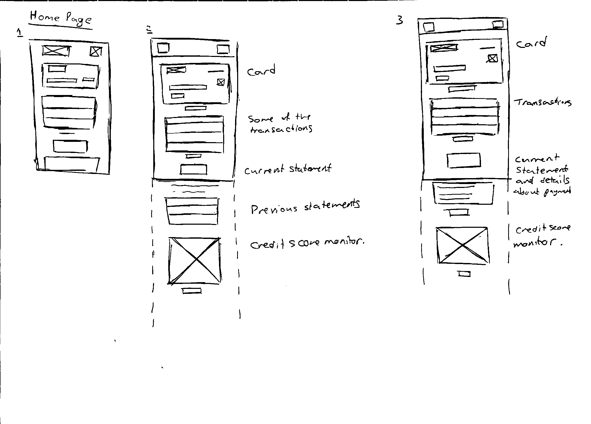
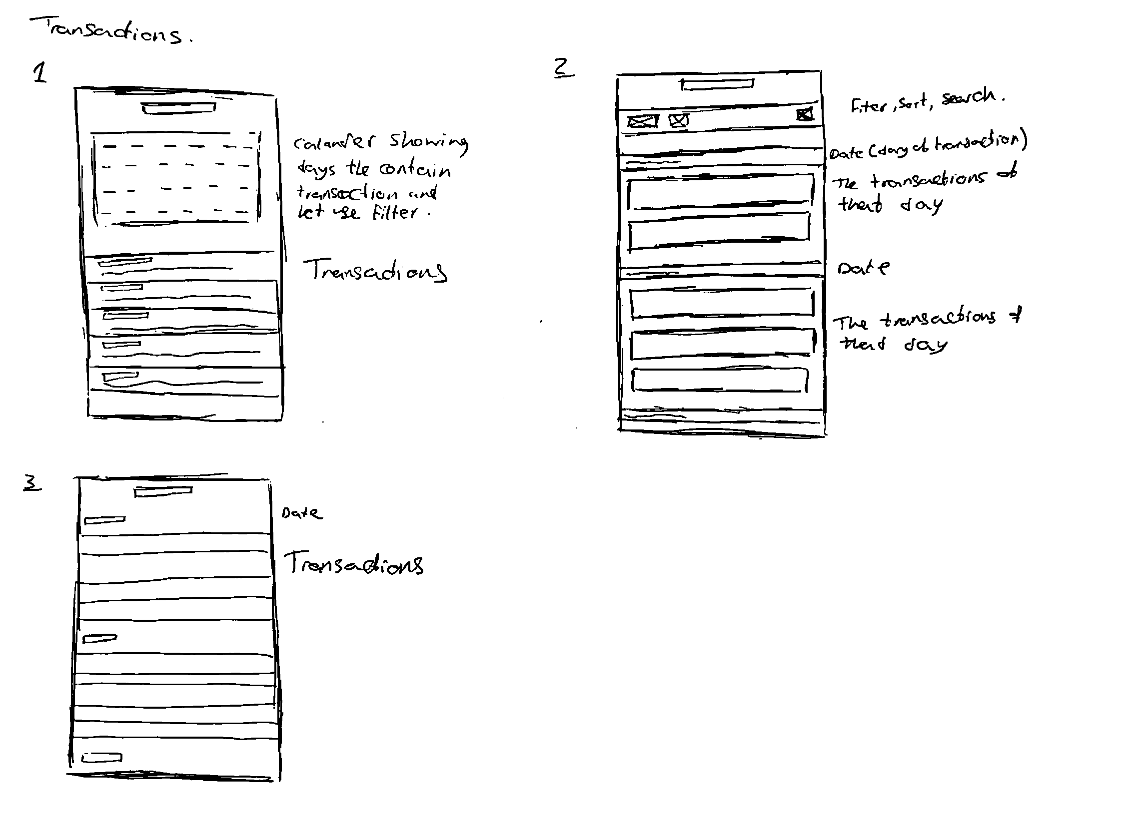
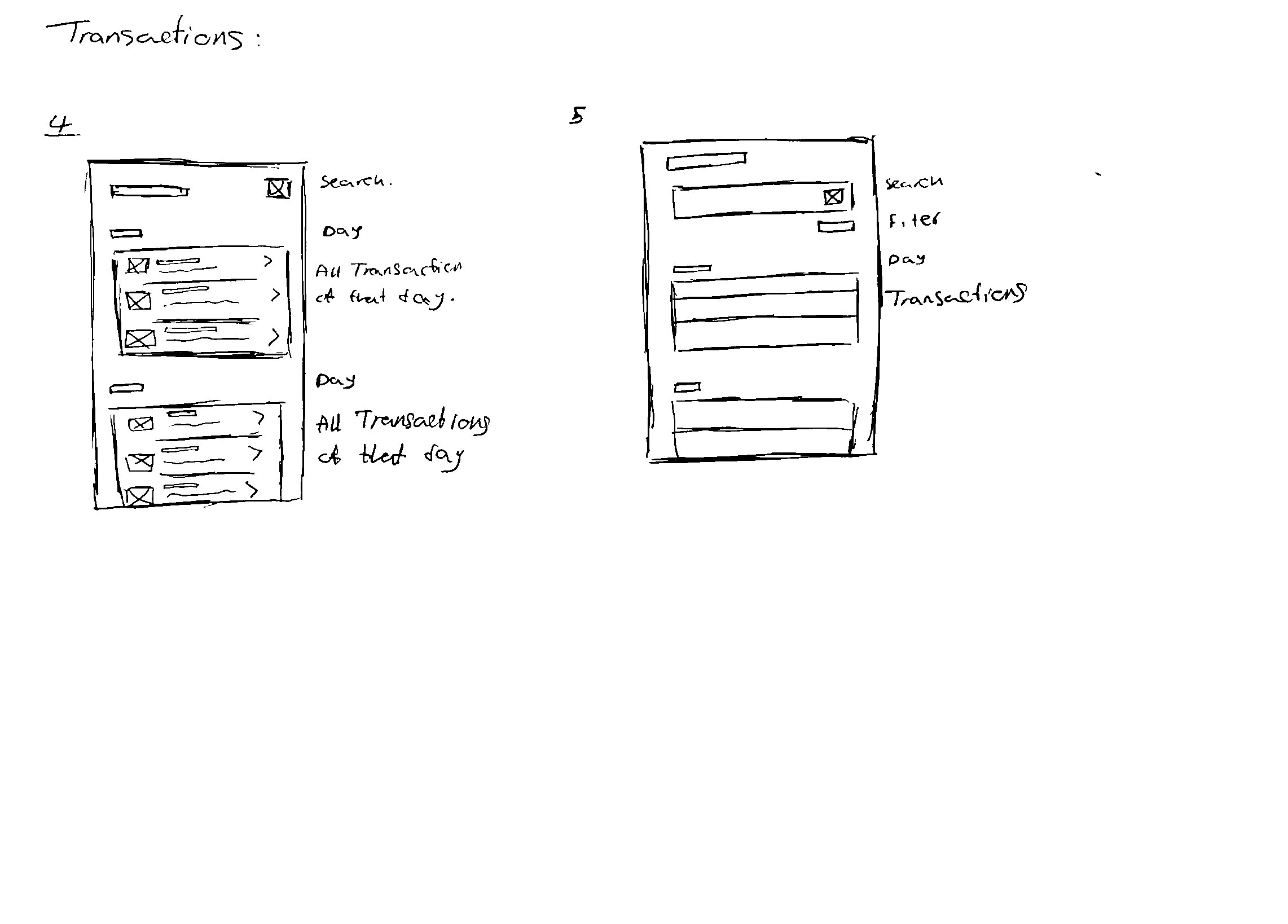
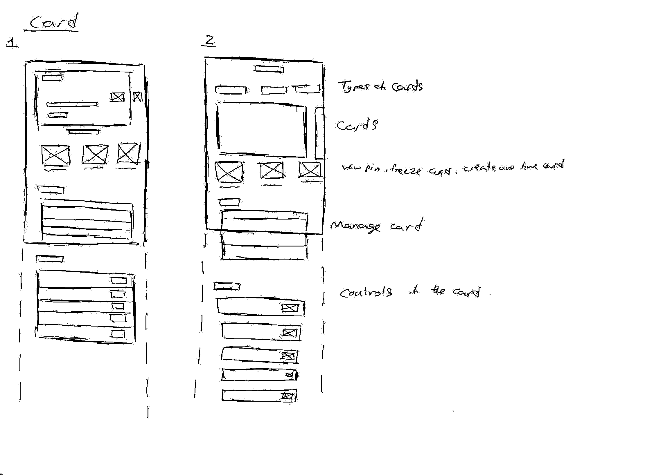
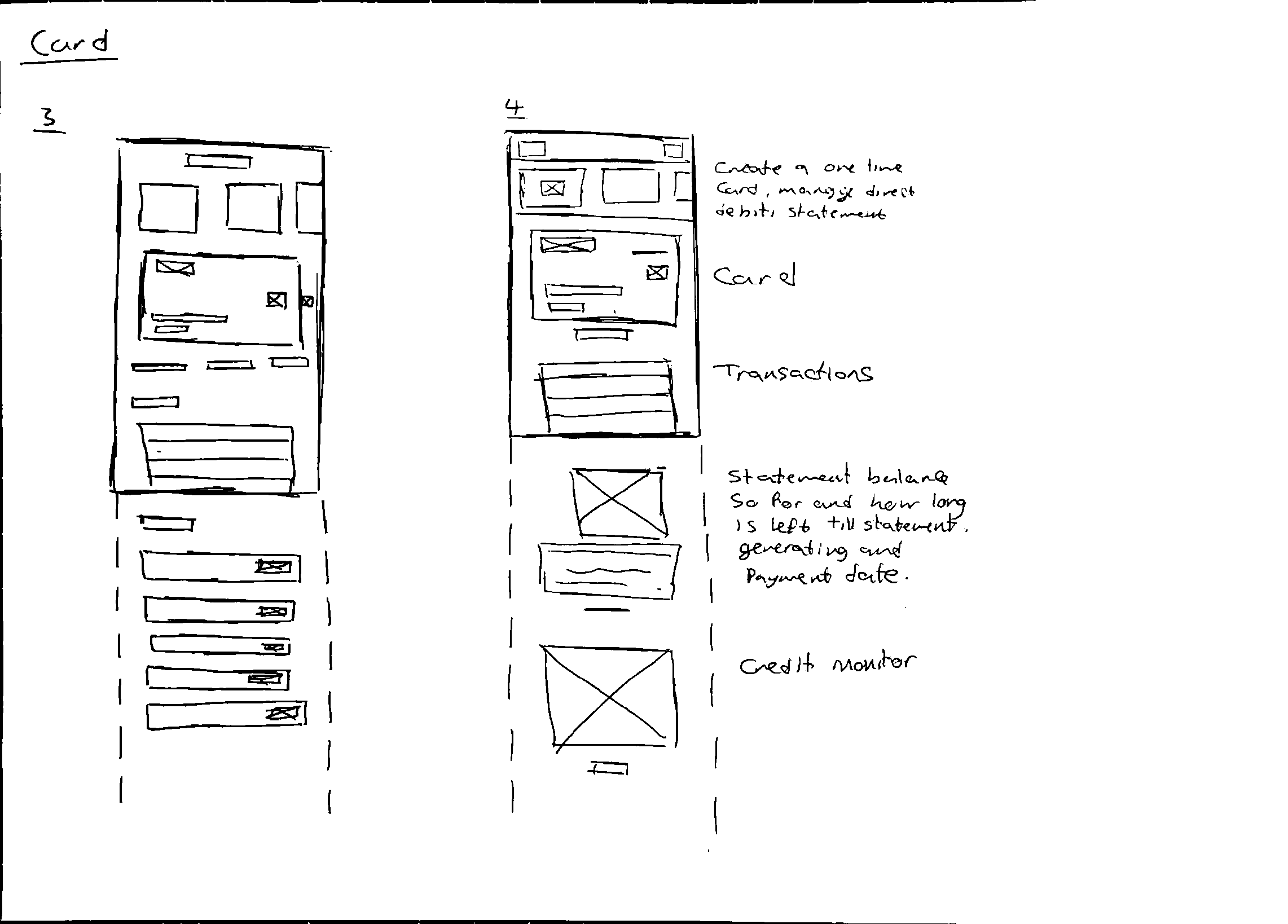
Here, I have included low-fidelity Wireframes, demonstrating part of my design process. I have also done Mid-fidelity and high-fidelity, which can be seen in the link above in my personal portfolio. (Due to the length of this page, I have included only low-fidelity sketches, which present my initial idea, which can be compared with the final outcome at the top of the page.
For a better view, please click to expand the images individually:
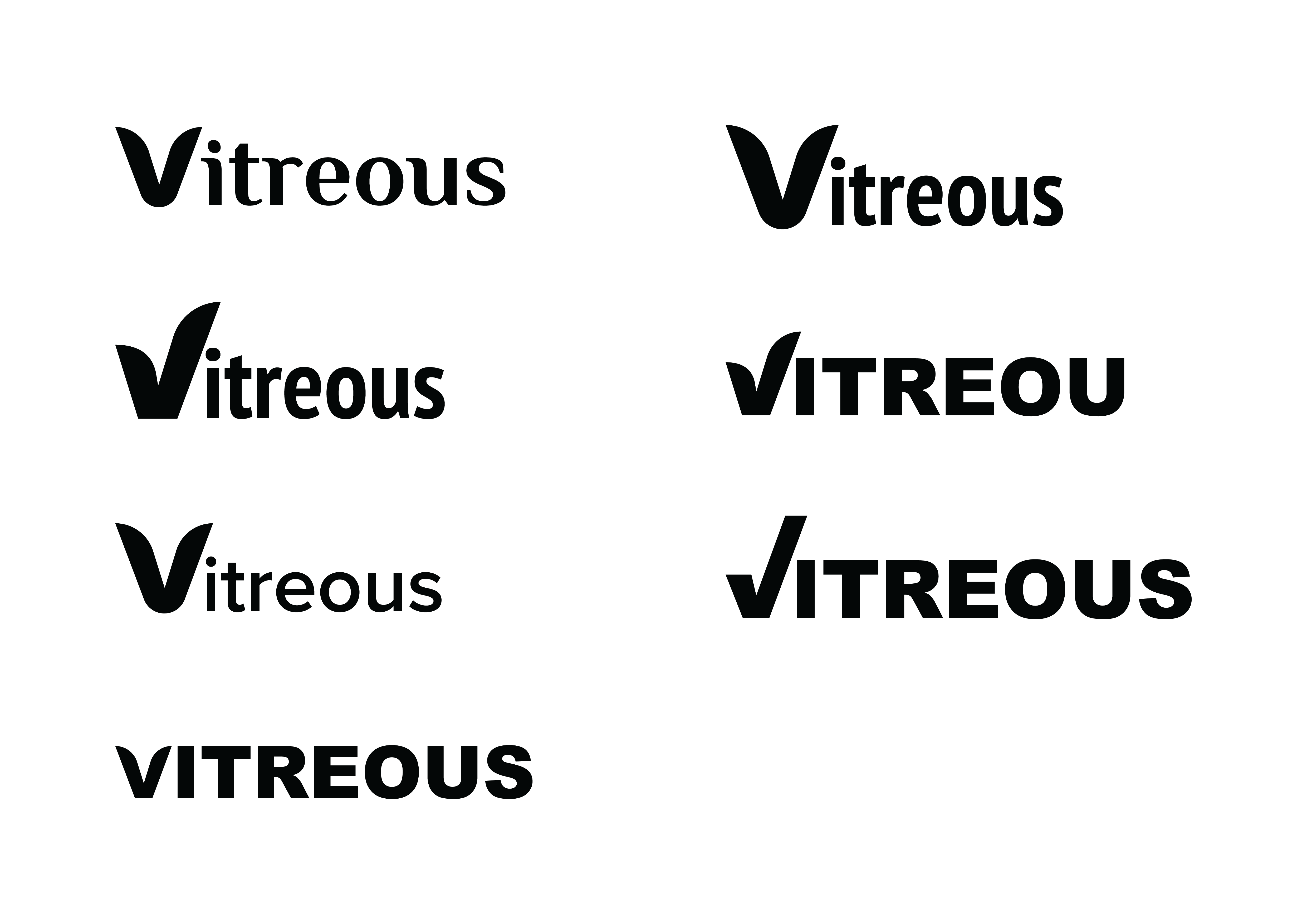
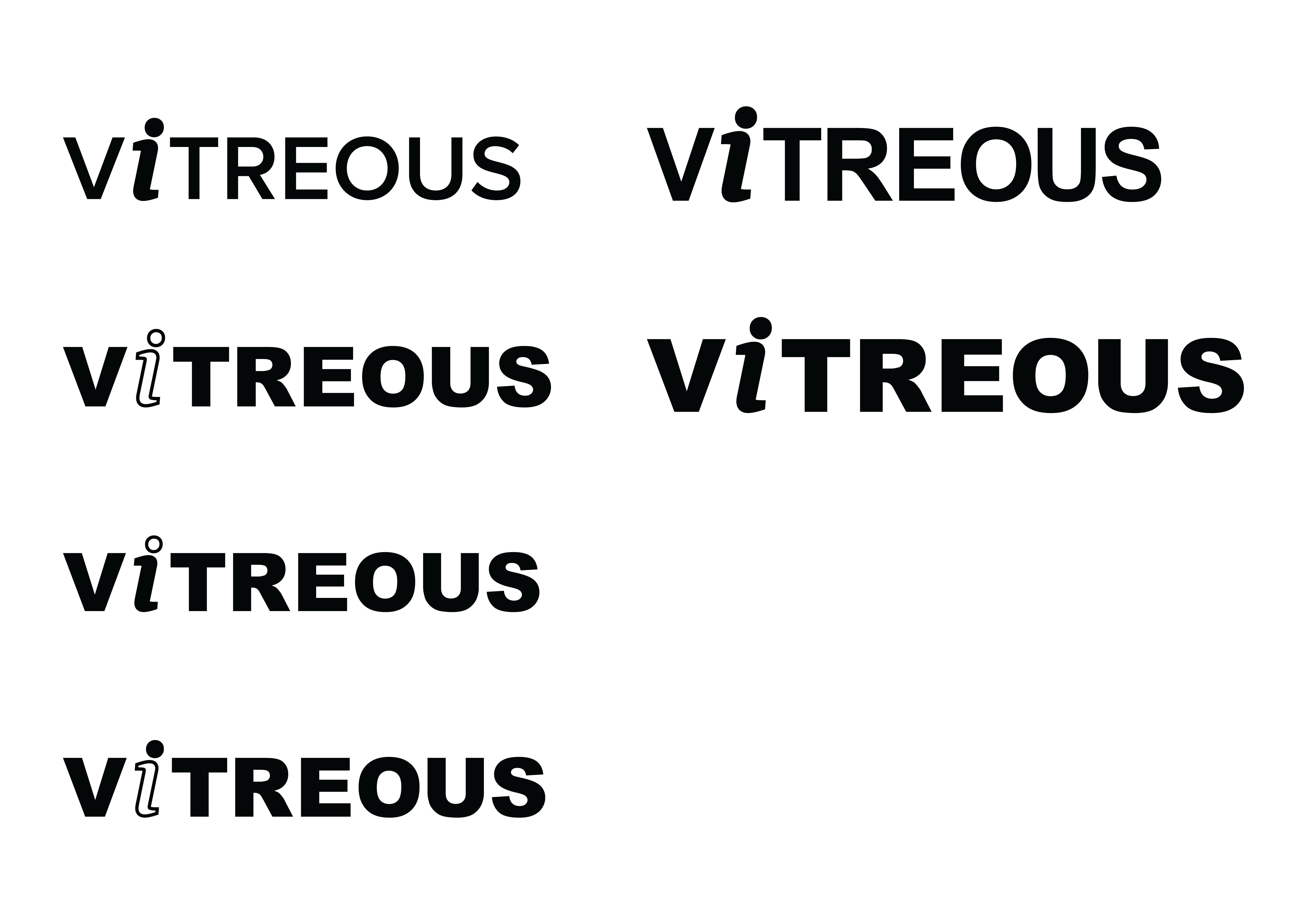
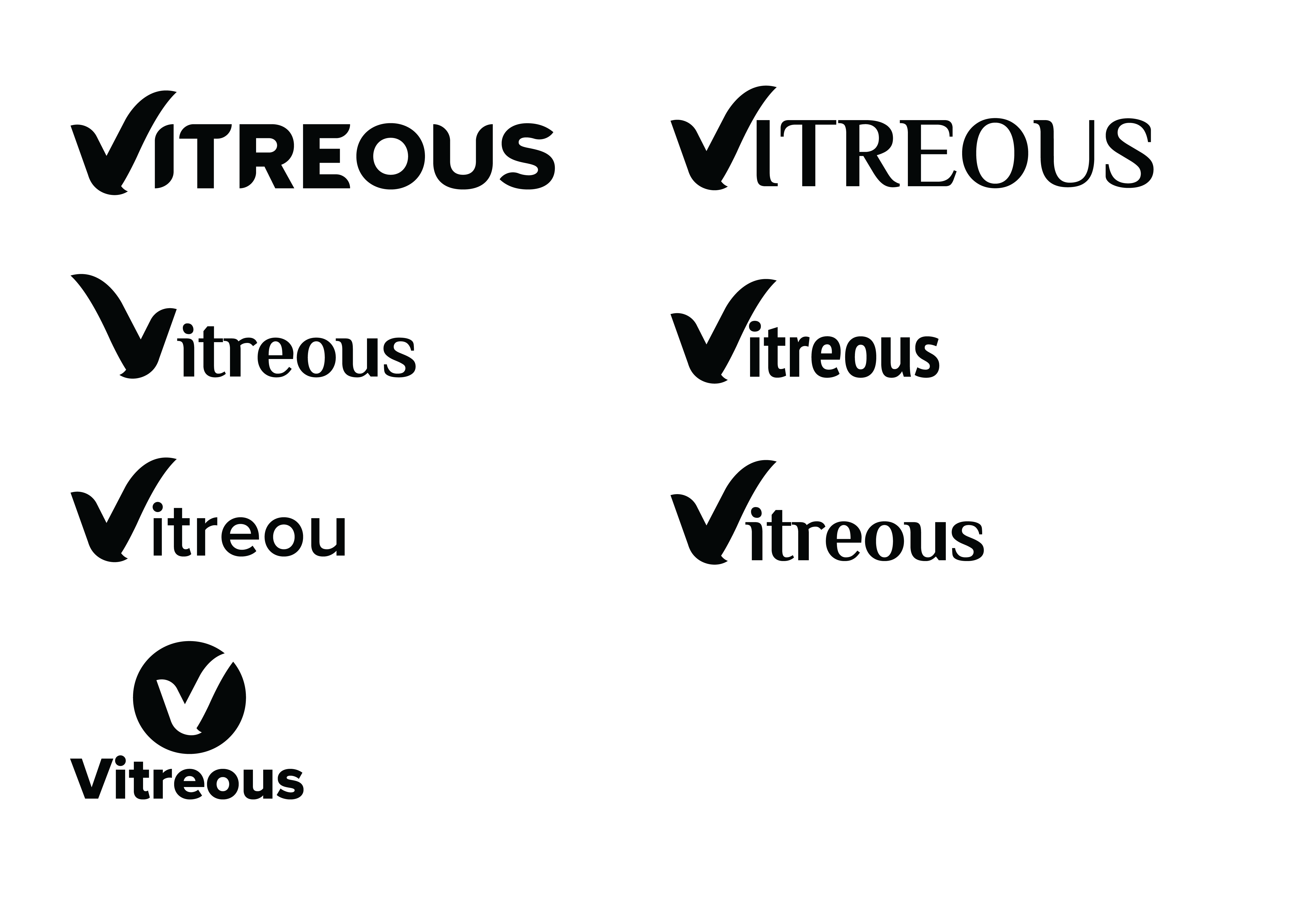
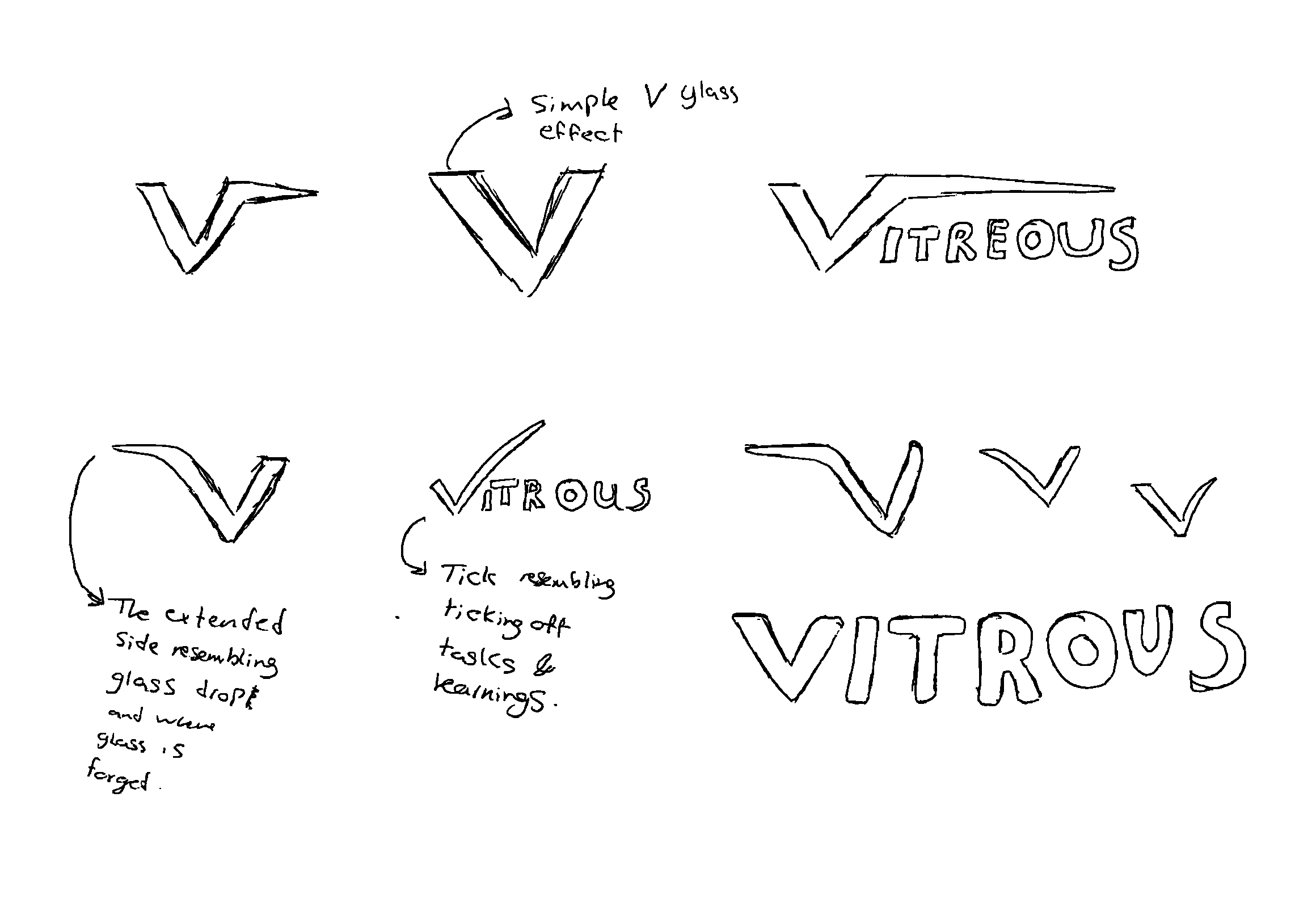
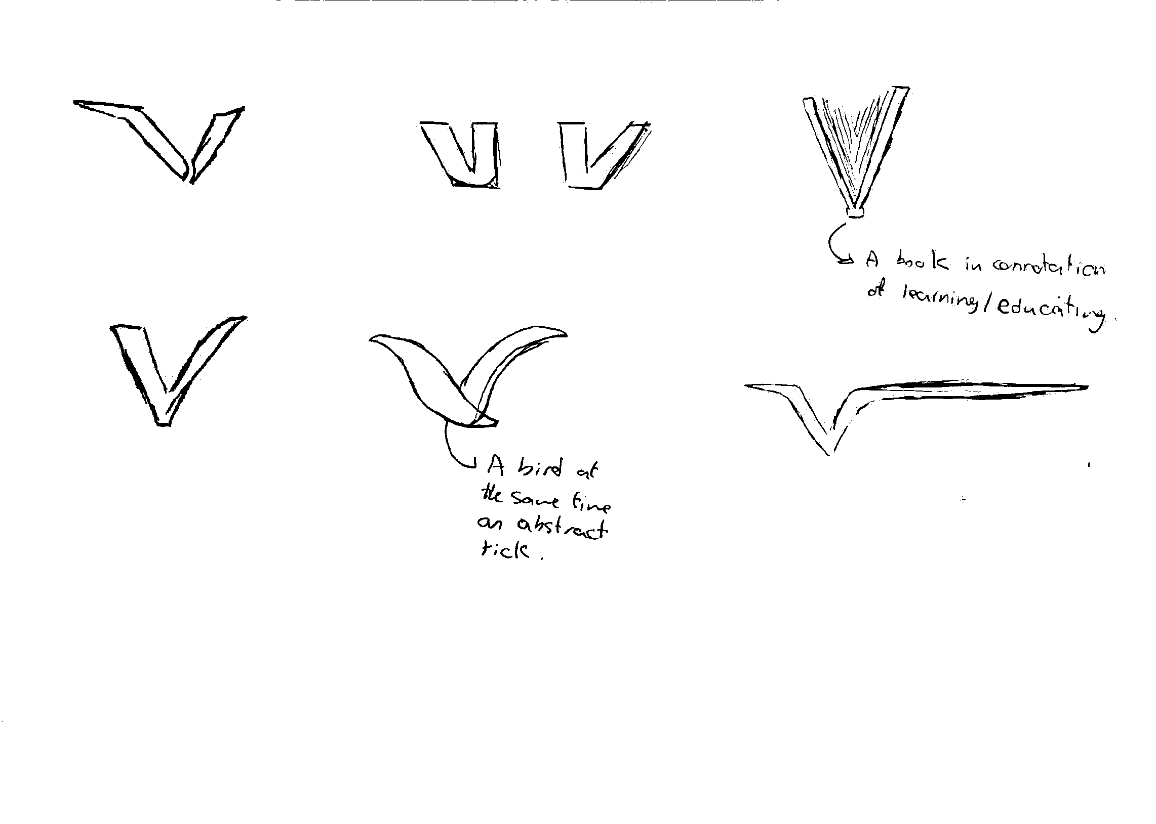
Here, I will demonstrate the branding that I have done for this project.
Here, I have demonstrated three ideas I took to digital experimentation from my sketches.
Here you can see idea generations which I have done through quick sketches
You viewed a shortened version of my project, from sketches to completed outcomes, with a selection of work processes that explain how I reached the outcome. If my work interests you, please use the link next to my profile picture to access my portfolio and contact details. (I have also included my Link tree, which you can easily access all my links and platforms)